

A cloud application architecture diagram is far more than a technical drawing. It's the strategic blueprint that shows how every component in your cloud system connects and interacts. Think of it as the master plan that keeps your development, operations, and business teams all on the same page, building toward a unified goal.
Why Cloud Architecture Diagrams Are Your Blueprint for Success
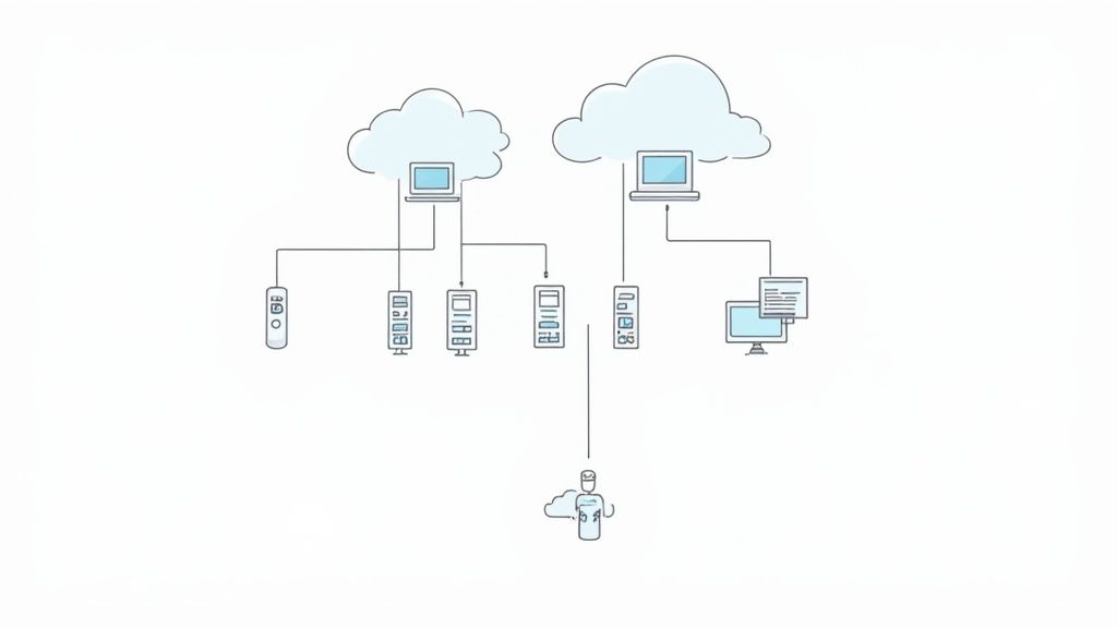
Let's get past the textbook definition. In the real world, a cloud architecture diagram acts as the single source of truth for your entire system. It maps out everything from high-level services down to the most granular data flows, bringing badly needed clarity to what can often be a messy cloud environment. For architects like us, these diagrams are essential tools for both communication and strategy.
This visual clarity is critical, especially when you look at how fast the market is growing. The money involved in cloud computing directly impacts how we design applications. End-user spending on cloud services is projected to leap from $595.7 billion in 2024 to an incredible $723.4 billion in 2025. That kind of growth puts immense pressure on us to build systems that are not just scalable but also incredibly resilient. This economic reality pushes us to design modular infrastructure that can flex with demand. You can dig deeper into these cloud spending trends and statistics on CloudKeeper.com.
Fostering Alignment Across Teams
One of the biggest wins from a well-made diagram is how it aligns different teams. When everyone is looking at the same visual representation of the system, collaboration just clicks into place.
- For Developers: It’s a clear map of services, APIs, and data dependencies. This helps prevent siloed work and those nasty integration surprises that pop up at the worst times.
- For Operations: It gives them a bird's-eye view of the entire infrastructure, which makes monitoring, troubleshooting, and capacity planning much more straightforward.
- For Business Stakeholders: It translates complex tech-speak into an understandable format, directly connecting the system's design to tangible business objectives.
A great cloud application architecture diagram isn't just about documenting what you've already built. It's about creating a shared language that empowers your entire organization to build better, faster, and more cohesively.
A Tool for Strategy and Growth
Beyond the day-to-day, these diagrams are absolutely vital for long-term strategic planning.
Think about it. When you need to add a new feature, prepare for a massive marketing campaign, or track down a mysterious performance bottleneck, where do you start? The diagram. It allows you to model potential changes and see their ripple effects across the system before a single line of code is ever written.
By visually laying out components like microservices, databases, load balancers, and third-party integrations, you create a living document that grows with your application. This blueprint ensures that as your system gets more complex, your team's understanding and control grow right along with it.
Defining Your Architecture Before You Draw
A brilliant cloud application architecture diagram doesn't just happen. It doesn’t start with dragging and dropping icons in a drawing tool. It starts with asking the right questions. Before you even think about visuals, you need to translate broad business goals into a concrete technical vision.
This foundational work is what separates a pretty picture from an accurate, functional blueprint for a system that solves real-world problems.
I’ve seen it time and again: experienced architects get this right by conducting thorough stakeholder interviews. They dig deeper than surface-level requests to uncover what truly matters. Instead of just asking, "What should it do?" they probe into the nitty-gritty of performance, security, and scale. This is where you bridge the gap between business needs and technical specifications.
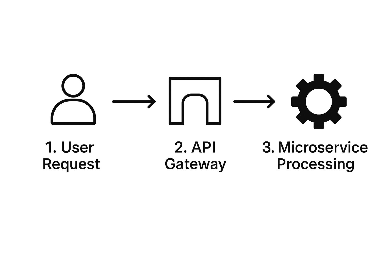
This simple flow shows how a user request travels through an API gateway to the microservices doing the heavy lifting. The diagram makes it clear how a central gateway can manage incoming traffic before routing tasks—a core concept in modern, scalable architectures.
Translating Goals into Technical Specs
Your first real task is to build a requirements checklist. This isn't about writing a novel; it's about creating a clear, shared understanding of the operational realities your application will face. This checklist will guide every single decision you make from here on out.
Here are the key areas you absolutely must nail down:
- Performance Needs: What’s the expected response time during peak load? Are some transactions more critical than others? For an e-commerce site, the checkout process needs to feel instant, while a batch report generation can afford to take a bit longer.
- Security Constraints: What kind of data are you handling? Is it sensitive personal information, or does it fall under strict regulations like GDPR or HIPAA? Answering this upfront dictates everything from encryption standards to access control policies.
- Expected Traffic: Are you planning for 1,000 users a day or 100,000? Will traffic be steady, or will you get slammed during special events? This directly impacts your choice of compute resources and your auto-scaling strategy.
- Data Volume and Velocity: How much data will your system create and store each day? Is it structured, like in a traditional database, or unstructured, like images and logs? Your answers will point you toward the right database and storage solutions.
By focusing on these non-functional requirements first, you ensure the architecture is built on a solid foundation. It prevents costly redesigns and ensures the system can handle real-world pressures from day one.
This initial planning phase is also the perfect time to think about the underlying infrastructure. For many businesses, choosing the right foundation is just as critical as the application design itself. If you're just getting started, you can learn more about affordable web hosting solutions for businesses to make sure your platform is built for growth.
Getting these answers upfront makes the actual drawing process faster, easier, and far more accurate.
Mapping Your Core Cloud Components

Alright, you've defined your requirements. Now it’s time for the fun part: turning that knowledge into a visual story. This is where your abstract ideas start to become a concrete map of your system. The goal here is to represent the essential building blocks of your application using icons that anyone in the industry will recognize on sight.
Forget about using generic squares and circles. A professional diagram uses specific, universally understood icons for each service. When another engineer glances at your diagram, they should immediately know the difference between a virtual machine and a container, or tell object storage apart from a relational database. This shared visual language is precisely what makes these diagrams so incredibly effective for clear communication.
Identifying the Building Blocks
Your first task is to take inventory of the main components your application needs to function. It helps to think in terms of what each part does. Pretty much every modern cloud application, from a simple web app to a complex data processing pipeline, will use a mix of these core services.
- Compute Services: This is the engine—it's where your code actually runs. Your choice here is foundational and will almost certainly be one of these:
- Virtual Machines (VMs): The classic workhorse of the cloud, giving you full control over the operating system.
- Containers: Services like Docker, often orchestrated with Kubernetes, offer lightweight and highly portable environments for your code.
- Serverless Functions: Perfect for event-driven tasks. These let you execute code without ever thinking about the underlying server infrastructure.
- Storage Solutions: This is where you’ll stash your data, files, and other digital assets.
- Object Storage: The go-to for unstructured data like images, videos, and backups.
- Block Storage: Think of this as a high-performance virtual hard drive that attaches directly to your VMs.
- Databases: The heart of your application, responsible for managing its state.
- SQL Databases: Ideal for structured data that fits neatly into rows and columns with a well-defined schema.
- NoSQL Databases: Flexible options built for unstructured or semi-structured data, frequently used in massive-scale applications.
A critical part of creating an effective cloud application architecture diagram is not just showing what the components are, but demonstrating how they interact. The lines and arrows connecting these icons are just as important as the icons themselves.
Drawing the Connections and Data Flows
Once you’ve placed your core components on the canvas, the real magic happens when you illustrate the relationships between them. You’re essentially tracing the journey of a user request as it travels through your system. Make sure you use labeled arrows to clearly show the direction of data flow and the type of interaction taking place.
For instance, an arrow might start from a user icon and point to a load balancer. The load balancer then directs traffic to a cluster of containers. Those containers, in turn, might query a NoSQL database for information and pull static assets like images from object storage before sending the final response back to the user. This visual narrative explains your application's logic at a single glance.
Many organizations are realizing that this component-based approach is essential for taming complexity, especially when integrating large-scale platforms. You might be interested in our guide on how ERP software can be represented within these architectural diagrams.
The entire industry is moving toward these cloud-native designs. In fact, a Gartner forecast predicts that over 95% of new digital workloads will be deployed on cloud-native platforms by 2025—a huge jump from just 30% in 2021. This trend is all about the need for greater agility and scalability, which is something these detailed diagrams help teams manage effectively. You can read more about these strategic cloud predictions on ITConvergence.com.
Let's be honest, the days of simple, single-cloud applications are mostly behind us. As systems get more sophisticated, our architecture diagrams have to keep pace. We're not just drawing a few boxes in one cloud anymore; we're mapping out the complex, real-world patterns that drive modern businesses. I'm talking about hybrid clouds, multi-cloud strategies, and the ever-growing world of edge computing.
These advanced designs definitely introduce more complexity, but a good diagram can cut right through the noise. Take a hybrid cloud setup, for instance. You need to clearly show the handshake between your on-premise datacenter and your public cloud provider. It’s more than just a line on a page; it’s about illustrating the secure VPN tunnels, the dedicated interconnects, and the data sync services that make the whole thing work as one cohesive unit.
And this isn't just a niche trend—it's quickly becoming the standard. Hybrid and multi-cloud strategies are now foundational for many organizations. In fact, research predicts that by 2025, a staggering 81% of enterprises will be operating in multi-cloud environments. They're deliberately using multiple providers to build resilience and sidestep vendor lock-in. This forces us as architects to create diagrams that show interconnected clouds, blending public, private, and edge resources to get the best performance. You can read more about these top cloud architecture trends shaping 2025 on Moldstud.com.
Visualizing Multi-Cloud and Hybrid Setups
When you're diagramming a multi-cloud architecture, your absolute number one job is clarity. The goal is to show how different cloud ecosystems collaborate without creating a diagram that looks like a bowl of spaghetti.
A really practical way to do this is by using visual boundaries or containers for each cloud. Think a blue-outlined box for Azure services and an orange one for AWS. Inside each box, you lay out the specific services you're using. Then, you draw labeled connectors to show how they talk to each other. For example:
- API Calls: Show how a microservice in one cloud hits a managed database in another.
- Data Replication: Illustrate data being synced from a primary database in Google Cloud to a disaster recovery instance in AWS.
- Centralized Logging: Depict logs from all environments flowing into a single observability platform like Datadog or New Relic.
Using this approach makes it instantly clear which services live where and how they all play together.
The goal of a multi-cloud diagram is to tell a story of collaboration, not chaos. It should highlight how you're using the best services from each cloud to build a superior, more resilient application.
Incorporating Security by Design
Advanced architectures demand that security is baked in, not bolted on. Your diagram is the first and best place to enforce this. Adopting a "security by design" mindset means making security a visible, non-negotiable layer of your architecture from the very beginning.
When you draw your cloud architecture diagram, you have to be explicit about security components. Don't just assume they’re there—draw them. This simple act forces critical conversations and makes sure security is considered at every single connection point.
Here are some key security elements you should always visualize:
- Identity and Access Management (IAM): Show which roles or services are granted permission to access specific resources.
- Web Application Firewalls (WAF): Put the WAF icon right in front of your public-facing endpoints to show how you're filtering out malicious traffic.
- Encryption: Use icons or clear labels to indicate where data is encrypted, both in transit (like a TLS connection) and at rest (in your databases or storage buckets).
- Private Networks: Clearly draw the boundaries of your Virtual Private Clouds (VPCs) and subnets to show how you’re isolating critical resources from the public internet.
By making security a visible part of the blueprint, your diagram becomes more than just a drawing. It becomes a powerful tool for building stronger, more defensible systems right from the start.
Creating Diagrams That People Actually Use

Let’s be honest. An outdated or confusing diagram is worse than having no diagram at all. It just creates noise. It misleads developers, confuses stakeholders, and ends up causing more problems than it solves.
If you want to keep your hard work from gathering digital dust, you have to build diagrams that are clear, maintainable, and actually valued by your team.
The most effective architects I've worked with treat their diagrams like code. What does that mean? Every significant change gets committed to a repository like Git, right alongside the application's source code. This simple practice creates a historical record, making it easy to see how the architecture has evolved and—most importantly—ensuring the diagram always reflects the system's current state.
Tailor the View to the Audience
Not everyone needs to see every single detail. One of the biggest mistakes I see is a single, monstrous cloud application architecture diagram that tries to be everything to everyone. This approach almost always backfires. It overwhelms executives with technical jargon and frustrates engineers who need more specific, granular information.
A much smarter strategy is to create multiple views of the same architecture, with each one tailored to its audience:
- Executive View (High-Level): Keep it simple. This view should focus on business value, showing the main application components and how they deliver key features. Leave out the low-level infrastructure details.
- Developer View (Logical): This one is for the engineering team. It needs to detail services, APIs, data flows, and the dependencies between microservices. It's the blueprint for implementation.
- Operations View (Physical): Built for the operations or DevOps team, this view includes specific cloud services, networking details like VPCs and subnets, and monitoring tools.
Think of it like a map. You can have a world map, a country map, and a city map. Each one is accurate, but they serve different purposes. Your architecture diagrams should work the same way.
This targeted approach guarantees that every stakeholder gets exactly the information they need, in a format they can understand and act on.
Use a Consistent Visual Language
Clarity is king. Using a consistent, universally understood set of icons isn't just a nice-to-have; it's non-negotiable for creating a professional diagram. When you use the official icons from AWS, Azure, or Google Cloud, any engineer can instantly recognize a specific service, whether it’s a Lambda function, a Cosmos DB instance, or a Kubernetes cluster.
Visual consistency goes beyond just icons. The way you draw lines, label data flows, and group related components should be uniform across all your diagrams. This creates a shared visual language that cuts down on ambiguity and makes your architecture instantly readable.
The principles of a strong visual hierarchy are crucial here. You can learn more about how a well-structured web designing layout improves usability, and those same ideas apply directly to diagrams. A clear visual structure guides the viewer's eye and makes complex information much easier to digest.
To help you stay on track, I've put together a quick checklist of best practices. Keep these do's and don'ts in mind every time you fire up your diagramming tool.
Diagram Best Practices Checklist
| Best Practice (Do) | Common Mistake (Don't) |
|---|---|
| Use official cloud provider icons for immediate recognition. | Use generic shapes (squares, circles) that require extra labels. |
| Create multiple, audience-specific views (e.g., executive, developer). | Build one massive, overly detailed diagram for everyone. |
| Keep diagrams version-controlled with your source code. | Let diagrams become outdated and disconnected from reality. |
| Clearly label data flows and connections to show direction. | Use ambiguous lines that don't explain the relationship between components. |
| Group related components within logical boundaries (e.g., VPCs, regions). | Scatter components randomly across the canvas. |
| Add a key or legend if you use any custom symbols. | Assume everyone understands your personal notation. |
Following this checklist will help ensure your diagrams are not only accurate but also genuinely useful tools that your team will reference again and again.
Of course. Here is the rewritten section, crafted to sound like an experienced human expert and match the provided style examples.
Common Questions About Cloud Architecture Diagrams
Even with a solid plan, a few questions always pop up when teams get serious about creating and maintaining their architectural blueprints. Let's walk through some of the most common questions I hear from fellow architects and dev teams. Getting these sorted out can really refine your approach.
Logical vs. Physical Diagrams
One of the first hurdles is understanding the difference between a logical and a physical diagram. They might sound interchangeable, but they tell two very different stories. Knowing which one to use is crucial for clear communication.
A logical diagram is all about the what. It shows the functional pieces of your system—things like microservices, databases, and user interfaces—and how they work together to deliver business value. It deliberately hides the nitty-gritty infrastructure details, which makes it perfect for talking with developers and product managers about how the system should behave.
A physical diagram, on the other hand, is about the how. It maps out the specific cloud services you're actually using (like AWS EC2 instances or Azure Functions), along with network details like VPCs and subnets. This is the diagram your operations and DevOps teams need to actually build and manage the infrastructure.
I like to think of it this way: the logical diagram is the architect's high-level concept, while the physical diagram is the detailed construction plan for the crew on the ground.
Keeping Diagrams Up to Date
"How often do we need to update our diagrams?" This question is critical. An outdated diagram isn't just useless; it’s actively misleading and can cause serious problems down the line.
Your architecture diagram should never be a "fire and forget" task. Instead, it should be integrated into your development lifecycle. A modern best practice is to adopt a "diagrams as code" approach using tools that can generate visuals from text-based definitions stored in your Git repository.
This means you should be updating your diagram anytime there's a meaningful change, such as:
- A new service or major component is introduced.
- A key data flow is changed or added.
- The underlying infrastructure is significantly altered.
When you tie diagram updates to your regular development sprints and CI/CD pipeline, you ensure it remains a reliable source of truth, not a historical artifact.
Creating Diagrams for Different Audiences
Is a one-size-fits-all diagram a good idea? It might seem efficient, but it almost never works. A diagram packed with technical detail will just confuse a business stakeholder, while a high-level one is useless to an engineer who needs specifics.
Smart architects know to create different views for different people. It’s a little extra work, but it pays off big time.
- For Stakeholders: Keep it high-level. Show the major business capabilities and how they deliver value to users.
- For Developers: Use a logical view that details the services, their APIs, and how data moves between them.
- For Operations: Provide a physical network view showing the infrastructure, security groups, and where monitoring tools are hooked in.
Creating these tailored perspectives makes your diagrams genuinely useful. It ensures everyone, from the C-suite to the front-line engineer, gets exactly the information they need to make smart decisions without getting bogged down in irrelevant details.
Ready to build powerful, scalable digital solutions with a team that understands architecture from the ground up? KP Infotech specializes in turning complex business needs into robust web and mobile applications. Let's build your blueprint for success together.