

Making your website mobile-friendly isn't just a technical task; it's about combining three critical elements: responsive design, lightning-fast performance, and an intuitive user experience. When these three pillars work together, your site doesn't just work on a phone—it feels natural, looks great, and functions flawlessly, no matter the device.
Why a Mobile-Friendly Website Is Non-Negotiable

Let’s be blunt: having a mobile-friendly website is no longer a "nice-to-have." It’s a core business strategy that directly shapes how people see your brand, whether they stick around, and ultimately, how much money you make. Today's users don't just prefer a good mobile experience; they expect it. If your site is a pain to use on their phone, they'll leave without a second thought.
This isn't just a feeling; the numbers back it up. As of 2024, mobile devices drive about 54.4% of all global website traffic. More alarmingly, studies show that mobile users are five times more likely to abandon a site if it isn't optimized for their device.
For local businesses, the stakes are even higher. A staggering 88% of users who search for local information on their phone will call or visit a business within 24 hours. A poor mobile experience means you are actively turning away customers who are ready to buy. You can dig into more website trends and statistics and see the data for yourself.
To truly build a site that wins over mobile users, you need a solid foundation built on responsive design, quick performance, and smart user experience.
Here’s a practical look at what each of these pillars means for your business.
The Pillars of a Truly Mobile Friendly Website
| Pillar | What It Means for Users | Why It's Essential for Business |
|---|---|---|
| Responsive Design | The website looks and feels "right" on any screen, from a small phone to a large desktop. Text is readable, and buttons are easy to tap. | It guarantees a consistent brand experience, builds user trust, and is a fundamental requirement for modern SEO. |
| Fast Performance | Pages load almost instantly. Users aren't left waiting for images to appear or content to load, which keeps them engaged. | Slow sites lose customers. Fast performance reduces bounce rates, improves conversion rates, and is a major ranking factor for Google. |
| Intuitive UX | Finding information is effortless. The navigation makes sense, and completing a task (like making a purchase) is simple and frustration-free. | A great UX guides users toward your business goals, whether it's a sale, a form submission, or a phone call. It turns visitors into loyal customers. |
When you master these three areas, you're not just checking a box for "mobile-friendly"—you're creating a powerful asset that drives real business growth.
The Impact of Google's Mobile-First Index
Perhaps the biggest reason to go all-in on mobile is Google's shift to mobile-first indexing. In simple terms, Google now primarily looks at the mobile version of your site to understand what it's about and how to rank it.
This means if your mobile site is slow, clunky, or missing content that your desktop version has, you're practically invisible in search results. It doesn't matter how beautiful your desktop site is; your mobile presence is what defines your search visibility today.
Thinking about how to make a website mobile-friendly isn't just a web developer's job anymore. It's a fundamental part of your customer acquisition strategy.
What Mobile-Friendliness Means for Your Business
A mobile-first approach delivers real, tangible benefits that ripple through your entire business. It's about building a stronger, more resilient brand online.
Here's exactly what you gain:
- Boosts Credibility and Trust: A professional, easy-to-use mobile site is a powerful first impression. It tells new visitors you care about their experience, which builds instant trust.
- Improves User Engagement: When pages load quickly and navigation is a breeze, people stay longer. They explore more pages, read more content, and are far more likely to take the next step.
- Drives Conversions: A frictionless path from discovery to action is everything. Whether someone is filling out a form, buying a product, or calling your office, a seamless mobile journey is essential for turning traffic into revenue.
Ignoring your mobile audience is like locking the front door to over half of your potential customers. It's a mistake you just can't afford to make.
Building a Truly Responsive Website
Responsive design is what makes a mobile-friendly website tick. It’s the behind-the-scenes magic that ensures your site looks and feels great on any device, whether it's a huge desktop monitor or a tiny smartphone screen. When it's done right, users never have to pinch, zoom, or scroll sideways. The website just works, feeling like it was custom-built for whatever device they're holding.
This isn't just one single technique. It's really a combination of three core ideas working in harmony: fluid grids, flexible images, and CSS media queries. Nailing these three creates that seamless, professional experience that keeps people on your site longer.
Fluid Grids: The Flexible Blueprint
Think of your website's layout like a blueprint. Old-school, fixed-width designs used rigid measurements, like pixels. A responsive site, on the other hand, is built on a fluid grid that uses relative units, most often percentages.
So, instead of telling a sidebar it has to be exactly 300 pixels wide, you tell it to take up 30% of the screen's width. This one simple shift allows your entire layout to expand or contract gracefully as the screen size changes. It’s the fundamental trick to making sure your content fits perfectly inside its container without ever looking broken.
Flexible Images and Media
It's not just the layout that needs to be flexible; your images and videos have to be, too. We’ve all seen it: you load a site on your phone and a massive image blows past the screen's edges, forcing you to scroll horizontally to see the whole thing. It's an instant credibility killer.
Thankfully, the fix is incredibly simple with a single line of CSS:
img {
max-width: 100%;
height: auto;
}
This tiny snippet tells the browser that an image can never be wider than the box it's inside. The height: auto; part is just as important—it makes sure the image keeps its original proportions as it shrinks, so it doesn't get squished or stretched. This is an absolute game-changer for mobile-friendliness. For a deeper dive into how these pieces fit into the bigger picture, understanding the fundamentals of modern web designing layouts is a great next step.
CSS Media Queries: The Magic Ingredient
Media queries are the special sauce that pulls everything together. They are basically "if/then" rules in your CSS that apply different styles based on the device's characteristics—most commonly, its screen width.
This is where the real "responsiveness" happens. Media queries let you say things like, "If the screen is smaller than 768 pixels wide, stack the columns on top of each other, make the font bigger, and turn the main menu into a hamburger icon."
Here’s what a media query looks like in the real world:
/* For mobile screens smaller than 600px /
@media screen and (max-width: 600px) {
.sidebar {
display: none; / Hide the sidebar completely /
}
body {
font-size: 16px; / Bump up the text size for readability */
}
}
By setting up these rules at different "breakpoints" (key screen widths like for tablets and phones), you can completely tailor the user experience and ensure your site is perfectly usable no matter where it's being viewed.
Optimizing for Speed on Mobile Devices

When it comes to making a website mobile-friendly, speed isn't just a feature—it's everything. Let's be honest, mobile users are impatient. They're often browsing on the go, with spotty connections. Every millisecond you can trim from your load time is a direct investment in keeping that visitor on your site.
This is more critical now than ever. We're looking at a future where over 64% of all web traffic will come from mobile devices by 2025. As 5G rolls out, people's expectations for instant-loading sites are only going to skyrocket. If your site lags, you’re waving goodbye to a huge chunk of the 4.32 billion active mobile internet users. You can dig into more stats on the rise of mobile internet traffic to see just how big this shift is.
Beyond Basic Image Compression
You’ve probably heard "compress your images" a million times. It's solid advice, but it's just the first step. To see real, noticeable performance gains, you need to get smarter about how you handle images.
- Implement Next-Gen Formats: It’s time to look past the old-school JPEGs and PNGs. Modern formats like WebP and AVIF are game-changers. They offer way better compression and quality, often cutting file sizes by 30% or more without any visible difference to the user.
- Embrace Lazy Loading: This is a simple but powerful technique. It tells the browser not to load images that are "below the fold" until the user actually scrolls down to them. This drastically cuts down the initial load time and makes the page feel much faster.
Combining modern image formats with lazy loading makes even an image-heavy page feel snappy and light. It's a non-negotiable step for creating a genuinely mobile-friendly experience.
Minify Code and Leverage Caching
All that code that makes up your site—the HTML, CSS, and JavaScript—can get bloated. It's full of extra spaces, comments, and line breaks that are useful for developers but are just dead weight for the browser.
Minification is the process of stripping out all that unnecessary junk. It's an automated process that shrinks your files, making them faster to download. Most modern content management systems and build tools have plugins or built-in settings that can handle this for you, often with just a single click.
Next up is browser caching. This is where you tell a visitor's browser to save static parts of your site—like your logo, CSS files, and key scripts—on their device. When they click to another page or come back later, their browser loads those files from its local storage instead of fetching them from your server all over again. The result? Subsequent page loads feel almost instantaneous.
Demystifying Core Web Vitals
Google has a specific set of metrics it uses to judge real-world user experience, known as Core Web Vitals. Getting a handle on these is your roadmap to a faster site.
Think of Core Web Vitals as Google's way of asking: How fast does the page feel? How quickly can someone interact with it? And does the layout jump around annoyingly as it loads?
Here’s a quick rundown of what matters:
- Largest Contentful Paint (LCP): This measures how long it takes for the biggest piece of content on the screen (usually a hero image or a big headline) to show up. You want this to be under 2.5 seconds.
- First Input Delay (FID): This measures how responsive your page is to the first thing a user does, like clicking a button. A good score here is under 100 milliseconds.
- Cumulative Layout Shift (CLS): This one is all about visual stability. It penalizes pages where elements, like ads or late-loading images, pop in and cause the content to jump around. Your goal should be a score below 0.1.
By focusing your optimization efforts on these three pillars, you're not just chasing arbitrary numbers. You're building a faster, more stable, and more enjoyable mobile experience that both your users and Google will love.
Designing an Intuitive Mobile User Experience

Getting your site to simply fit on a mobile screen is a decent starting point, but let's be honest—it's only half the job. To create a truly mobile-friendly website, you have to build an experience that feels natural and completely effortless for the user. This is where UX design stops being a technical checkbox and starts becoming an art form, one that focuses on how people actually use their phones day-to-day.
This focus on user perception has a direct impact on your brand's credibility. The numbers don't lie: a staggering 61% of users admit they have a better opinion of businesses that offer a good mobile experience. When you consider that nearly 90% of YouTube views and over 98% of Facebook usage happens on mobile, a smooth UX isn't just a nice-to-have; it's non-negotiable for engaging people where they already are. For more data on this, check out the latest mobile marketing and user behavior stats on webfx.com.
Create Thumb-Friendly Navigation
Think about it. On a desktop, users have a mouse cursor for pinpoint precision. On mobile, they have thumbs, which are a lot bigger and clumsier. Designing for "fat-finger" mistakes isn't an insult to your users; it’s just a smart, practical reality of mobile design.
Your buttons, links, and any other clickable elements need to be large enough to be tapped easily without a user accidentally hitting something else. As a rule of thumb, Apple suggests a minimum target size of 44×44 pixels for anything a user can tap.
Pro Tip: It's not just about making buttons bigger. You also need to add adequate space between them. This padding creates a vital buffer zone that dramatically cuts down on those frustrating mis-clicks and instantly improves the overall feel of your site.
Prioritize Readability and White Space
There's nothing worse than landing on a site and having to immediately pinch and zoom just to read the text. It's a dead giveaway of a poorly designed mobile site. Your starting point for any body text should be a minimum of 16px. This is widely accepted as the most comfortable font size for reading on a small screen without causing eye strain.
Just as crucial as the size of your text is the space around it. White space, often called negative space, is the empty area between your paragraphs, images, and other page elements. It’s anything but "wasted" space—it plays a critical role in your design.
- It reduces clutter, making your content feel clean and well-organized.
- It improves comprehension by breaking up walls of text into digestible chunks.
- It draws the user's eye to important elements like your call-to-action buttons.
Using white space generously makes your site feel less cramped and far more professional. If you're looking to build a solid design foundation, our guide on effective website design principles goes into more detail on these strategies.
Simplify Forms for Mobile Conversions
Forms are a massive friction point for mobile users. Typing on a tiny keyboard is already a pain, and a long, complicated form is one of the fastest ways to kill your conversion rates.
The secret here is to simplify ruthlessly. Be honest with yourself and ask only for the information that is absolutely essential. For example, if you're trying to grow an email list, you probably just need an email address. Don't sabotage yourself by also asking for a first name, last name, and phone number.
You can also use HTML5 input types to make the entire process smoother. This is a small technical tweak that tells the phone which keyboard to show the user.
| HTML5 Input Type | Mobile Keyboard Displayed | Best Use Case |
|---|---|---|
type="email" | Keyboard with @ and . symbols | Email address fields |
type="tel" | Numeric keypad | Phone number fields |
type="number" | Numeric keypad | Fields for quantity or age |
type="url" | Keyboard with / and .com keys | Website address fields |
This little detail shows users you’ve actually thought about their experience, making them much more likely to stick around and complete the form.
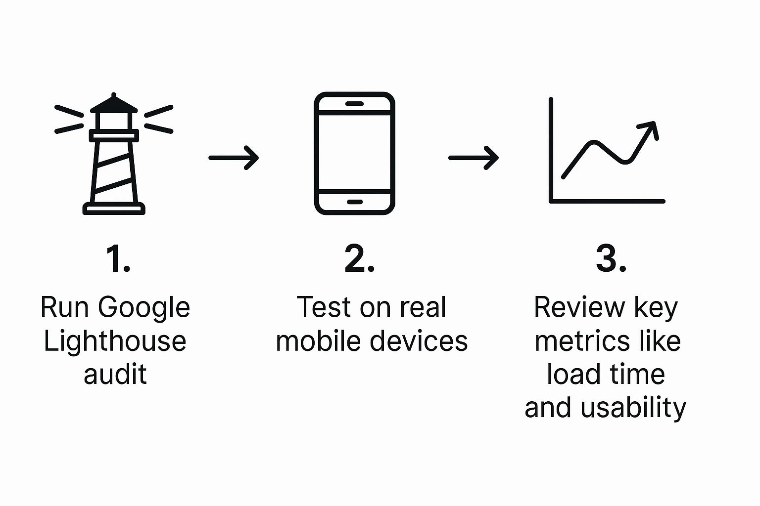
Alright, you've put in the hours designing and optimizing. Now comes the moment of truth: testing. You can't just cross your fingers and hope your site is mobile-friendly—you have to prove it.
This isn't about giving it a quick glance on your own phone. Proper testing is a deliberate process that separates a site that just works on mobile from one that delivers a genuinely fantastic experience. It’s how you find and squash those pesky bugs before your visitors ever see them.
Start with a Quick Sanity Check
Your first stop should always be a quick, automated audit. I always recommend starting with Google’s free Mobile-Friendly Test. Just pop in your URL, and in a few seconds, you'll get a straightforward pass-or-fail verdict. More importantly, it tells you if Google sees your site as technically mobile-friendly, which is a big deal for your SEO.
Go Deeper with Browser Developer Tools
For a more hands-on inspection, your browser's developer tools are your best friend. In Chrome, just right-click anywhere on your page, hit "Inspect," and click the little phone-and-tablet icon. This toggles the device simulation mode.
This feature is an absolute lifesaver. You can instantly see how your site looks and behaves on different screen sizes, from a compact iPhone SE to a sprawling Galaxy tablet. It's the perfect way to make sure your responsive breakpoints are firing correctly and that your fluid grids and flexible images are resizing as you intended.
You can even throttle the connection down to "Slow 3G" to feel what it's like for a user on a shaky network. It’s a real eye-opener.
Nothing Beats a Real Device
Simulators are fantastic for catching layout problems and doing quick checks, but they can't perfectly mimic the real-world experience. Things like touch accuracy, how smooth a gesture feels, or how the phone's operating system interacts with the browser—you can only truly gauge that on actual hardware.
Emulators are excellent for catching layout bugs, but only a real device can tell you if your buttons are truly "thumb-friendly" or if a scrolling animation feels choppy. You don’t need a massive budget for this; even testing on a couple of popular iPhone and Android models will reveal critical insights that simulators miss.
This simple, three-part testing workflow—automated, simulated, and real-world—is how you ensure your site is technically sound, visually perfect, and genuinely usable for every visitor.
As you go through your testing, it helps to have a simple checklist. Here's what I always look for:
- Touch Targets: Are buttons and links easy to tap? A good rule of thumb is a minimum size of 44×44 pixels.
- Readability: Is the body text at least 16px? Nobody wants to pinch-and-zoom just to read a sentence.
- Load Times: How does the site feel on a simulated 3G network? Performance is a core part of the user experience and is heavily influenced by your hosting. If you're struggling here, you might want to explore some affordable web hosting solutions for businesses that can give you a speed boost.
- No Horizontal Scrolling: Does all the content fit neatly within the viewport? If users have to scroll sideways, something is broken.
By consistently running these checks, you'll build the confidence that your website provides a solid, frustration-free experience for everyone, no matter what device they're holding.
Choosing the Right Mobile Testing Tool
While manual checks are essential, several tools can automate and simplify the process. Picking the right one depends on your needs, from a quick spot-check to a comprehensive audit.
| Tool | Primary Use | Best For | Cost |
|---|---|---|---|
| Google's Mobile-Friendly Test | SEO & Basic Usability | A quick, initial pass/fail check to see how Google views your site. | Free |
| Browser DevTools | Layout & Responsive Debugging | Developers and designers checking breakpoints and visual rendering. | Free |
| BrowserStack | Real-Device Cloud Testing | QA teams needing to test on thousands of real device/browser combinations. | Paid Plans |
| LambdaTest | Real-Device Cloud Testing | Similar to BrowserStack, offering a wide range of devices for cross-browser testing. | Paid Plans |
These tools aren't mutually exclusive. In fact, a professional workflow often involves using a combination of them to cover all your bases and deliver a truly polished mobile site.
Answering Your Mobile Optimization Questions
When you start diving into making a website mobile-friendly, a lot of questions pop up. It's a field with its own jargon and best practices, so it's natural to have a few things you're not sure about. Let's clear up some of the most common queries I hear from clients and developers.
Should I Use Responsive Design or a Separate Mobile Site?
This one's pretty straightforward: responsive design is almost always the right answer. A responsive site uses one URL and a single set of code that smartly adapts to any screen size, from a tiny phone to a huge desktop monitor. This makes it much easier to manage, update, and maintain.
Building a separate mobile site, usually on an "m." subdomain, means you're literally running two different websites. That’s double the work, double the content to update, and a potential nightmare for SEO. You can easily run into duplicate content issues that confuse search engines.
In fact, Google itself strongly recommends responsive design. It's far more efficient for their crawlers to index a single, adaptable site. Unless you have a very specific, highly complex reason to build a completely separate mobile experience, just stick with responsive. It’s the modern standard for a reason.
What’s the Real Difference Between “Mobile-Friendly” and “Responsive”?
People often use these terms as if they mean the same thing, but there's a subtle but important distinction.
Think of "mobile-friendly" as the basic requirement. It means your site is usable on a phone. The text is readable without pinching and zooming, and the links are tappable. But the experience might still feel a bit clunky or awkward.
"Responsive design," on the other hand, is the how. It's the technical method used to create a truly seamless experience. A responsive layout actively rearranges itself to provide the best possible view on any device.
A responsive website is always mobile-friendly, but a site can be mobile-friendly without being fully responsive. In today's world, you should be aiming for a fully responsive design, not just checking the "mobile-friendly" box.
How Fast Should My Mobile Site Actually Load?
On mobile, every millisecond counts. Users have very little patience. While the technical goal for Largest Contentful Paint (LCP)—a key Google Core Web Vital—is under 2.5 seconds, the real-world answer is simple: as fast as you can possibly make it.
Countless studies show that when load time goes from one second to three, the probability of a visitor bouncing increases dramatically. If your site isn't interactive within a few seconds, you're bleeding visitors and potential customers. Making your site fast isn't just a technical task; it's a critical part of providing a good mobile experience.
Ready to create a seamless, high-performance website that captivates users on every device? KP Infotech specializes in building responsive, fast, and intuitive digital experiences. Contact us today to transform your online presence.