

Of course. Here is the section rewritten to sound completely human-written, following the specific style and formatting requirements.
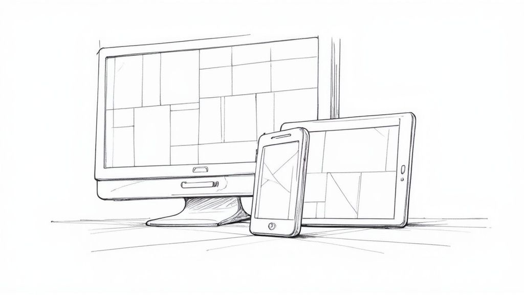
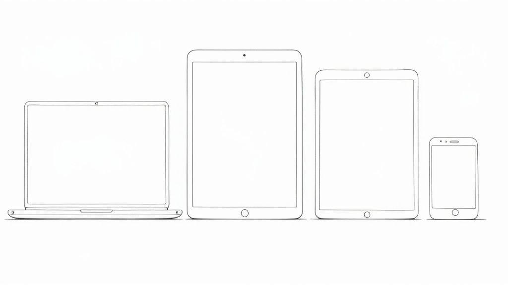
Responsive web design isn't just a technical buzzword; it's the core philosophy behind any website that works beautifully on every device. The basic idea is to create one site that flows and adapts perfectly, whether someone is viewing it on a massive desktop monitor, a tablet, or their smartphone.
Think of it like water—it effortlessly takes the shape of whatever container it's in. That’s what a responsive site does for a screen, guaranteeing a great experience for every visitor.
The Foundation of Modern Web Experiences
It wasn't always this way. In the early days, websites were built with rigid, fixed-width layouts. This worked fine when everyone used a similar-sized desktop monitor, but the explosion of mobile phones and tablets made that approach obsolete almost overnight.
A fixed-width site on a phone is a nightmare. It forces users to pinch, zoom, and scroll sideways just to read a line of text—a frustrating experience that sends them looking for the "back" button.
Why Responsiveness Is Non-Negotiable
By 2025, responsive design had become the standard, with an estimated 90% of all websites built to be adaptive. This shift was no accident. With mobile devices now driving over 61% of global web traffic, a mobile-first mindset is essential.
Google's own research backs this up, showing that 72% of users are more likely to stick with a website that offers a smooth experience across all their devices. A responsive site isn't just a "nice-to-have"; it directly impacts user happiness, search engine rankings, and, ultimately, your bottom line. This user-centric approach is at the heart of modern website design.
To make this adaptability happen, designers and developers rely on three core pillars:
- Fluid Grids: Layouts that use flexible, percentage-based units instead of rigid pixels.
- Flexible Media: Images, videos, and other media that scale gracefully to fit their containers.
- Media Queries: CSS rules that apply different styles depending on the screen size or device capabilities.
A responsive website adapts to the user, not the other way around. It anticipates their context—be it a phone on a bus or a monitor at a desk—and delivers the best possible version of your content.
Understanding these principles is the first step toward building websites that are not only functional but also intuitive and future-proof. Before we dive into each one, let's get a quick overview of how they all work together.
Core Principles of Responsive Web Design at a Glance
To really get a handle on responsive design, it helps to see its foundational pillars side-by-side. The table below breaks down the three essential components, showing what each one does and why it's so critical for a modern website.
| Principle | Core Concept | Primary Goal |
|---|---|---|
| Fluid Grids | Layout elements use relative units (like percentages) to resize proportionally. | Create a flexible foundation that adapts to any screen width. |
| Flexible Media | Images and other media are set to scale within their containing elements. | Prevent media from "breaking" the layout on smaller screens. |
| Media Queries | CSS rules apply specific styles only when certain conditions are met (e.g., screen width). | Tailor the design for different contexts, like mobile vs. desktop. |
Together, these three principles form the bedrock of responsive design, allowing a single website to provide a consistent and optimized experience for every user, on every device.
Building Layouts with Fluid Grids
At the heart of every truly responsive website is the fluid grid. Think about it like furnishing a room with a modular shelving system. Instead of one giant, immovable bookcase, you have individual blocks you can rearrange and resize. These blocks can fit perfectly into a small alcove or expand to fill an entire feature wall.
That's exactly how a fluid grid works on a screen.
Instead of locking layout elements into place with rigid pixel dimensions, a fluid grid uses relative units—most often, percentages (%). This simple but game-changing shift means every piece of your layout is defined in relation to its parent container. As the screen expands or shrinks, every element resizes proportionally, keeping its relationship with everything else intact.
The result? A layout that flows gracefully from one screen size to another. You can finally say goodbye to that awful horizontal scrollbar and content that gets awkwardly chopped off. It's the first and most important step toward building a site that feels natural on any device.
Fixed vs. Fluid: A Practical Comparison
To really see the difference, let’s look at the code for a simple two-column layout. First, the old, rigid way using fixed pixels.
Example A: Fixed-Width Layout
A pixel-based layout is brittle. If the browser window is even slightly narrower than the combined width of your columns (960px in this example), the whole thing breaks. Users are left scrolling sideways just to see your content. It’s a terrible experience.
.container {
width: 960px; /* A fixed, unyielding width /
}
.main-content {
width: 600px; / 600px of the 960px /
float: left;
}
.sidebar {
width: 300px; / 300px of the 960px */
float: right;
}
Now, let's switch this over to a fluid, percentage-based grid. The math is simple: just divide the element’s width by the container’s width.
Example B: Fluid Grid Layout
This layout is inherently flexible. The main-content will always take up 62.5% of the available space, and the sidebar will always occupy 31.25%, regardless of the device.
.container {
max-width: 960px; /* Sets a max size, but allows shrinking /
}
.main-content {
width: 62.5%; / (600 / 960) * 100 /
float: left;
}
.sidebar {
width: 31.25%; / (300 / 960) * 100 */
float: right;
}
This one small change turns a fragile structure into a dynamic one. It’s a non-negotiable step in building a responsive site, and understanding the fundamentals of a good web designing layout is crucial to getting it right.
Why You Should Start with Mobile First
The fluid grid concept is a perfect match for a powerful strategy called "mobile-first" design. This approach completely flips the traditional design process on its head. Instead of designing a huge, complex desktop site and then desperately trying to subtract things to make it fit a phone, you start with the smallest, most constrained view first.
Designing for mobile first forces you to prioritize what's truly essential. It's a content-first strategy that asks, "What is the absolute most important information and functionality our user needs?"
This has a few massive advantages:
- Cleaner Code: Starting small gives you a simpler, more efficient base of HTML and CSS. You then use media queries to "progressively enhance" the layout for bigger screens, adding bells and whistles only when there's room for them.
- Better Performance: Mobile users, often on slower connections, aren't forced to download heavy images and scripts meant for a desktop. The site loads faster, which is critical since over 60% of all web traffic now comes from mobile devices.
- Focused User Experience: By getting rid of the clutter from the very beginning, you create a more focused and intuitive experience that works beautifully on every device.
The mobile-first approach isn't just about screen sizes; it's a philosophy of disciplined, user-focused design. When you pair this strategy with the technical flexibility of fluid grids, you get a website that doesn't just adapt—it performs.
So, you’ve got your fluid grid dialed in, and the layout itself is beautifully elastic. Fantastic. But what happens when you start putting stuff inside it? This is where many responsive designs fall apart, and the usual suspect is inflexible media.
Large, high-resolution images and videos are notorious for breaking layouts. If an image is hard-coded with a fixed width, say 800 pixels, it’s going to stubbornly stay 800 pixels wide. On any screen smaller than that, it will spill out of its container, creating that hideous horizontal scrollbar we all hate.
Think of it like this: you've built a fantastic, stretchy picture frame (that’s your fluid grid), but now you're trying to force a rigid piece of plywood into it. It’s never going to fit properly. This is precisely why flexible media is the second pillar of responsive design—it’s all about making your content as adaptable as your layout.
The most straightforward fix is surprisingly simple, often just a single line of CSS. By applying max-width: 100% to your images and videos, you’re telling the browser, "Never let this media element get wider than the container it's in." It can shrink down as much as needed, but it won’t stretch beyond its original size, which also prevents ugly pixelation.
img, video {
max-width: 100%;
height: auto;
}
This little snippet is your first line of defense. It ensures your visuals scale down gracefully, keeping your fluid layout intact no matter the device.
Going Beyond Just Shrinking Images
Making images smaller is a solid start, but a truly modern approach goes much deeper. Simply squishing a massive desktop image down for a tiny mobile screen creates a huge performance bottleneck. Your user is still downloading the full-size, high-resolution file, even though they can only see a thumbnail-sized version.
This wastes their data, tanks your page load speed, and can hurt your Core Web Vitals—a major factor in how Google ranks your site.
A truly responsive experience isn’t just about aesthetics; it’s about performance. Serving a giant image to a mobile user is like forcing them to download an entire feature film just to watch a 10-second trailer. It just doesn’t make sense.
To fix this, we need to get smarter. The goal is to serve up the right image for the right context, ensuring mobile users get small, fast-loading files while those on fancy "Retina" displays get the crisp, sharp visuals they expect.
Serving the Right Image for the Job
Thankfully, modern HTML gives us powerful tools to automate this entire process. Instead of a one-size-fits-all approach, we can offer the browser a "menu" of image options and let it pick the best one for the user’s screen.
- The
srcsetAttribute: You can add this right onto a standard<img>tag. It lets you provide a list of different-sized versions of the same image. The browser then uses its own logic to pick the most efficient file based on the user's screen size and resolution. No more wasted bytes. - The
<picture>Element: This element gives you ultimate control. It lets you swap out image sources based on specific conditions, like screen width. This is perfect for what designers call "art direction"—showing a sweeping landscape photo on a desktop but a tightly cropped, portrait-oriented version on a phone.
Mastering these techniques is non-negotiable for building fast, efficient websites. They are especially crucial when you're aiming for an experience that feels as slick as a native app. For anyone serious about this, learning more about building a mobile web app offers a masterclass in performance optimization.
Best Practices for Flexible Media
At the end of the day, handling media is a balancing act between visual polish and raw speed. Keep these best practices in mind to nail both.
- Compress Everything: Before you write a single line of code, run your images through a compression tool. Services like Squoosh or ImageOptim can drastically cut down file sizes with minimal loss in quality.
- Use Modern Formats: Ditch JPEG and PNG when you can. Next-gen formats like WebP or AVIF offer far better compression and quality. They load faster and look great.
- Lazy Load Offscreen Images: Don't make users download images they can't even see yet. Lazy loading tells the browser to wait to load images "below the fold" until the user actually scrolls down to them. This makes the initial page load feel lightning-fast.
- Set Explicit Dimensions: Always include the
widthandheightattributes on your<img>tags. When you combine this withmax-width: 100%, the browser can reserve the correct amount of space for the image before it loads, preventing that annoying content jump as the page renders.
Using Media Queries for Strategic Breakpoints
If fluid grids are the flexible skeleton of your website and flexible media is the adaptive content, then media queries are the brains of the entire operation. They are the intelligent rules that tell your design how and when to change, bringing all the other responsive principles together into one cohesive experience.
Think of media queries like a smart thermostat for your layout. A thermostat doesn’t just keep the house at one constant temperature; it kicks on the A/C when it gets too hot and cranks up the heat when it’s too cold. Media queries do the exact same thing for your design, applying different CSS styles whenever the screen "temperature"—its width—hits a specific point.
These trigger points are known as breakpoints. A breakpoint is simply a defined screen width where your layout needs to adapt to stay usable and look great. That three-column layout that works perfectly on a desktop monitor will quickly become a cramped, unreadable mess on a smartphone. A breakpoint lets you tell the browser, "Once the screen gets this narrow, switch to a single-column layout instead."
From Device-Driven to Content-Driven Breakpoints
One of the most common mistakes I see is choosing breakpoints based on popular devices, like setting one for an "iPhone" and another for an "iPad." This strategy is incredibly fragile. The market is flooded with thousands of different screen sizes, and new ones pop up all the time. Tying your design to specific gadgets is a losing game that only leads to endless, frustrating maintenance.
The modern, best-practice approach is to let your content dictate the breakpoints. Start with your mobile-first design and slowly expand the browser window. The moment your content starts to look awkward—when text lines become too long to read comfortably or elements feel unbalanced—that’s your cue. That's exactly where you need a breakpoint.
This content-first method makes your design far more robust and future-proof. It adapts based on the needs of the content itself, not on some arbitrary list of devices that will be outdated next year.
The infographic below illustrates this mobile-first workflow. Notice how the design and content flow from the smallest screen outward, progressively enhancing the layout as more space becomes available.
By starting with a solid foundation on mobile, you create a much more stable and efficient base to build upon for tablet and desktop experiences.
Deciding between a device-based or content-based strategy is a crucial first step. The table below breaks down the pros and cons of each to help you make an informed choice.
Common Breakpoint Strategies for Responsive Design
| Strategy | Approach | Advantages | Disadvantages |
|---|---|---|---|
| Device-Based | Breakpoints are set based on the screen sizes of specific popular devices (e.g., iPhone, iPad, common monitors). | – Conceptually easy to understand. – Can be faster for initial mockups. | – Becomes outdated quickly as new devices emerge. – Fails to cover the vast range of screen sizes. – Leads to high maintenance and frequent updates. |
| Content-Based | Breakpoints are added only when the content or layout begins to "break" or look awkward as the screen size changes. | – Future-proof and durable. – Creates a better user experience across all devices. – Focuses on content integrity, not arbitrary dimensions. | – Requires more thoughtful design and testing. – Can be less intuitive for absolute beginners. |
While a device-based approach might seem like a shortcut, letting your content guide the breakpoints will always result in a more resilient and user-friendly design in the long run.
Practical Media Query Examples
A media query is just a simple @media rule you add to your CSS file. The most common type is a min-width query, which is perfect for a mobile-first approach. It tells the browser to apply a set of styles only when the viewport is at least a certain width.
Let's walk through a classic scenario: a blog with a main content area and a sidebar. On mobile, we want them stacked vertically for easy reading.
/* Mobile-First Styles (Default) /
.main-content, .sidebar {
width: 100%; / Full width on small screens */
}
/* Tablet & Desktop Breakpoint */
@media (min-width: 768px) {
.main-content {
width: 70%;
float: left;
}
.sidebar {
width: 30%;
float: right;
}
}
In this example, all screens get the single-column styles by default. But as soon as the screen width hits 768px, the media query activates, and the layout smartly shifts to the two-column format. This is progressive enhancement in action.
Of course, you can use media queries for more than just layout changes:
- Adjusting Typography: Increase font sizes and line spacing on larger screens to improve readability.
- Changing Navigation: Switch from a compact "hamburger" menu on mobile to a full horizontal navigation bar on desktops.
- Hiding or Showing Elements: Display extra information on bigger screens that would just clutter a mobile view.
By using media queries strategically, you gain precise control over the user experience at every possible screen size. This completes the trifecta of responsive web design principles, ensuring your site doesn't just shrink—it intelligently reshapes itself to be perfect for every user.
Of course. Here is the rewritten section, crafted to sound like it was written by an experienced human expert, following all the specified requirements.
How Responsive Design Drives Business Growth
Knowing the principles of responsive design is one thing. But the real magic happens when you see how they directly fuel what every business wants: growth. A website that works perfectly on any device isn't just a neat technical trick—it's a powerful tool for making customers happier and boosting your bottom line.
Think about it. When a visitor lands on your site and it just works on their phone, it builds instant confidence. They feel like you care about their experience. This seamless journey does more than just look good; it directly impacts how they behave.
Turning User Experience Into Conversions
The link between a smooth user experience and higher conversions is rock solid. When someone tries to use your site on mobile and they’re forced to pinch, zoom, and scroll sideways just to read a sentence, they’re gone. That frustration immediately tells them your business is unprofessional or just doesn't get it.
That friction kills conversions before they even have a chance to happen. A responsive design, on the other hand, removes all that hassle. It presents a clean, accessible, and intuitive interface on every screen, building immediate trust. That little psychological boost is often all it takes to push a user to the next step—whether that's buying a product, filling out a form, or signing up for your newsletter.
The numbers don't lie.
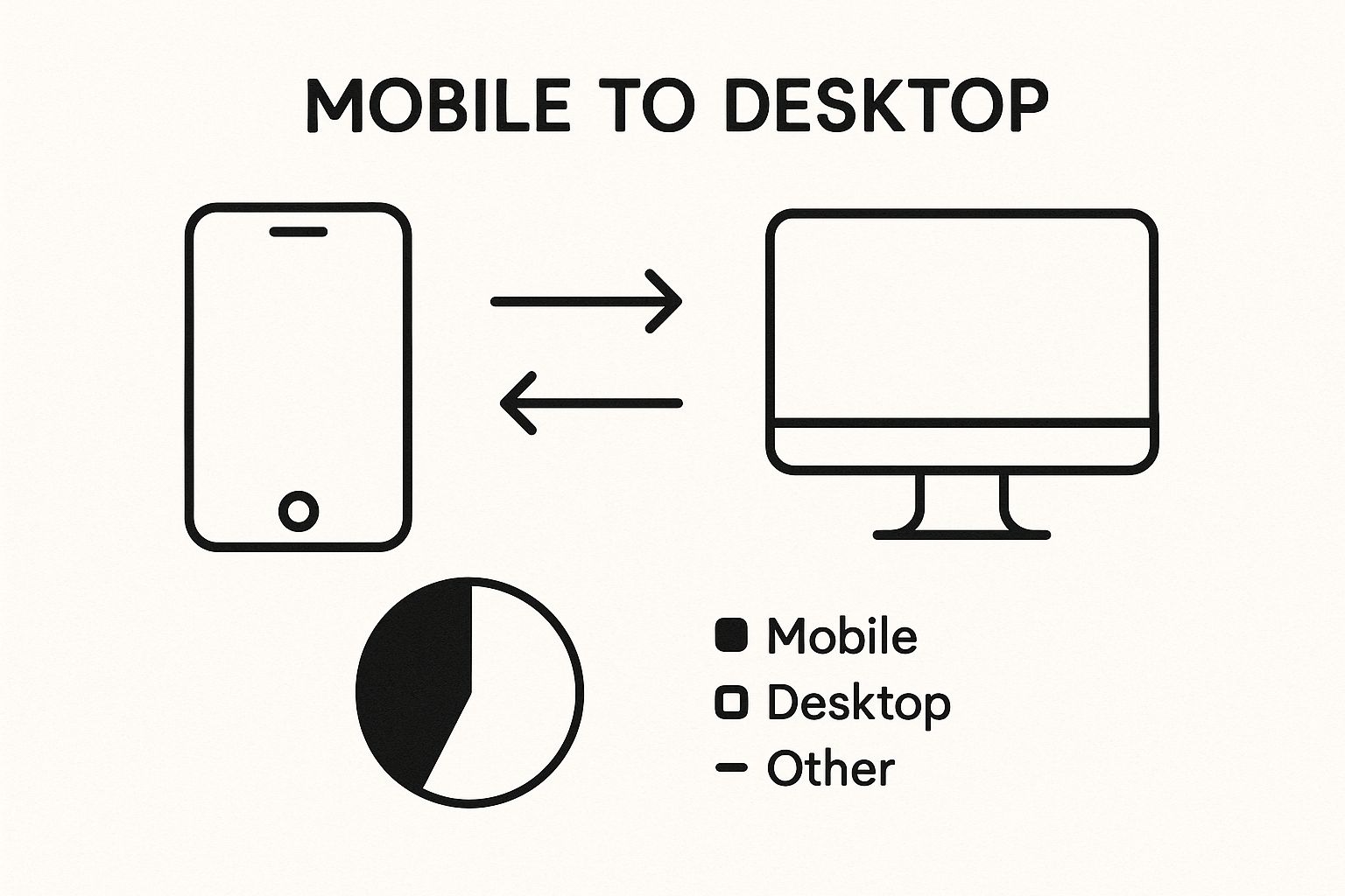
Studies show that responsive websites tend to have conversion rates about 11% higher than their non-responsive counterparts. Even more telling, a massive 62% of businesses reported a direct spike in sales after switching to a responsive design. And when you learn that 8 out of 10 users will ditch a site if it doesn’t display properly, the business case becomes impossible to ignore. You can explore more data on these design impacts to see the full picture.
Gaining a Competitive Edge with SEO
Beyond the immediate wins in engagement and sales, one of the biggest business perks of responsive design is its impact on SEO. A few years back, Google made a huge shift to mobile-first indexing. This means Google primarily looks at the mobile version of your site to decide how to rank it.
If your site isn’t responsive, you’re shooting yourself in the foot. Google's crawlers will find a clunky, hard-to-use mobile site, and that can tank your rankings across the board—not just on mobile. A website built with responsive design sends all the right signals to Google:
- One URL for All Devices: This makes Google's job easier. It prevents the duplicate content headaches that often come with having separate mobile (
m.example.com) and desktop sites. - Improved User Signals: When people stick around longer and bounce less, it tells Google they found what they were looking for. These are powerful ranking factors.
- Enhanced Local SEO: Think about it—most local searches happen on a phone while someone is out and about. A responsive site is absolutely essential for grabbing that local foot traffic.
At the end of the day, responsive design isn’t a "nice-to-have" feature anymore. It’s a core business strategy. It shapes how people see your brand, how they engage with your content, and most importantly, how easily they can find you in the first place. It's a fundamental investment in building a digital presence that actually drives growth.
Here is the rewritten section, designed to sound completely human-written and natural, following the provided style guide.
Your Responsive Design Implementation Checklist
Alright, you’ve learned the principles. Now it’s time to move from theory to the real world. Think of this as your final pre-flight check before launching your responsive site.
Getting your fluid grids, flexible media, and breakpoints to play nicely together is what separates a truly adaptive experience from a broken one. Let's walk through the final checks to make sure everything is solid.
Layout and Grid Validation
Your fluid grid is the skeleton of your responsive site. Even a tiny crack in the foundation can cause the whole structure to collapse on different screen sizes. Take a moment to double-check these critical points.
- Go with Relative Units: First, confirm that your main layout pieces are built with relative units. We're talking percentages (%), viewport width (
vw), orfrunits if you're using CSS Grid. Fixed-pixel widths for major containers are a recipe for disaster. - Set a
max-width: Your main container needs amax-widthproperty. This simple rule is a lifesaver—it stops your content from stretching into an unreadable mess on massive monitors while letting it shrink down perfectly on smaller screens. - Hunt for Overflow: This one is easy but essential. Slowly drag your browser window from its widest to its narrowest. Keep an eye out for a horizontal scrollbar popping up at the bottom. If you see one, that's a red flag signaling a layout problem you need to fix.
Media and Content Flexibility
Static, stubborn media can single-handedly ruin an otherwise brilliant responsive layout. Your images, videos, and iframes need to be just as flexible as your grid.
Remember, a responsive site isn’t just about looking good; it’s about performing well. Making a user on a 4G connection download a massive desktop image is a performance failure. Your goal is to serve the right asset for the right context.
- The Universal Media Rule: At a minimum, make sure you have a global CSS rule like
img, video { max-width: 100%; height: auto; }. This is your first and most powerful line of defense against media that tries to break out of its container. - Think Performance First with Images: Don't stop there. Whenever you can, use the
<picture>element or thesrcsetattribute. This lets you serve up different image sizes based on the user's screen, which is a massive win for loading times and your Core Web Vitals scores. - Check Your Touch Targets: Grab a phone or fire up your browser's emulator. Can you easily tap every button and link without zooming in? A good rule of thumb is to aim for a minimum touch target size of 44×44 pixels. Anything smaller can be frustrating for users.
Breakpoint and Testing Procedures
Finally, you need to put your design through its paces. Rigorous testing across a wide range of screen sizes is the only way to be sure your media queries are firing correctly and the layout is adapting just as you planned.
- Emulate Everything: Use the device emulation tools built right into browsers like Chrome or Firefox. Don't just test the latest iPhone—check out popular Android models, tablets, and even smaller laptops.
- Let Content Be Your Guide: Don’t just test at your specific breakpoints. The real magic happens when you manually resize the browser and watch for those awkward "in-between" sizes. This is where you'll discover if your content needs a breakpoint, not just a particular device.
- Run an Automated Check: For an objective opinion, run your site through Google’s Mobile-Friendly Test. It’s a quick and easy way to spot any major usability issues on mobile that you might have missed.
Common Questions Answered
As you start putting these responsive design principles into practice, you’ll probably run into a few questions. Let's tackle some of the most common ones to clear things up and help you build better, smarter websites.
What’s the Real Difference Between Responsive and Adaptive Design?
It's a common point of confusion, but the difference is pretty straightforward once you get the hang of it.
Think of responsive design like a single, ultra-flexible t-shirt made of a special fabric that stretches or shrinks to perfectly fit whoever wears it. It uses a fluid grid that continuously adjusts to any screen, big or small. This "one-size-fits-all" approach is what makes it so future-proof.
Adaptive design, on the other hand, is like having a closet with a few fixed t-shirt sizes: Small, Medium, and Large. When someone visits your site, the server checks their screen size and hands them the t-shirt—or layout—that fits best. It doesn't stretch; it just serves up one of a few predefined options.
To put it simply: Responsive design is fluid and constantly adjusts, while adaptive swaps between a few fixed layouts. Most of the time, responsive is the way to go, but adaptive can sometimes give you more precise control over how your site looks on very specific devices.
Where Does “Mobile-First” Fit Into All This?
"Mobile-first" isn't a separate principle but a strategy—a powerful way to apply the principles we've discussed.
Instead of designing a big, complex desktop site and then struggling to pare it down for a phone, you flip the script. You start with the smallest screen, the mobile view.
This forces you to be ruthless with your priorities. You have to focus on the absolute essentials first: the core content and key actions a user needs. From there, you use breakpoints to progressively enhance the design. As more screen real estate becomes available, you can add in more columns, fancier features, and larger assets. It's a recipe for a faster, cleaner, and more focused website.
Is Responsive Design Just About Screen Size?
Not anymore. While screen width is still the primary trigger, modern responsive design is about responding to the user's entire environment. It’s less about the device and more about the context.
Thanks to advanced CSS media queries, we can create experiences that adapt to much more than just a screen's dimensions.
For example, a website can now react to:
- Device Orientation: Is the user holding their phone in portrait or landscape mode? The layout can change accordingly.
- Screen Resolution: We can serve up super-sharp, high-DPI images to devices with "Retina" displays for a crystal-clear look.
- User Preferences: Modern CSS can even respect a user's operating system settings. If they've enabled "dark mode," your site can automatically switch to a dark theme. Or, if they prefer less animation, you can honor their
prefers-reduced-motionsetting.
Ready to build a digital presence that’s as powerful as it is adaptable? KP Infotech specializes in creating high-performance websites and applications that deliver seamless experiences on every device. Learn how our end-to-end development and design services can drive your business growth.