

Let's be honest, raw data is overwhelming. It’s like a library filled with unorganized books. Analytics and data visualization act as your expert guide, transforming that chaos into clarity by finding the most important stories buried in the numbers and telling them in a way everyone can understand.
Turning Data Into Decisions
Raw data on its own is just a collection of facts and figures, often sitting quietly in spreadsheets or databases. It holds a ton of potential, but it rarely gives you straight answers right out of the box.
This is where the powerful combination of analytics and data visualization comes in. Together, they create a bridge from raw information to actionable insight. Think of it as a two-step process: first, you find the story, and then you tell it effectively.
Analytics is the investigation. It’s the process of sifting through all those numbers, identifying patterns, uncovering relationships, and discovering trends that aren't obvious at first glance. It’s the detective work that answers your most critical business questions.
Data visualization, on the other hand, is the art of storytelling. It takes the complex findings from your analytical work and translates them into an intuitive, graphical format. This visual approach makes your insights accessible to a much broader audience, regardless of their technical background.

Why This Combination Is Essential
Without analytics, your visualizations would just be pretty pictures without any real substance or direction. And without visualization, your analytical discoveries might stay buried in dense reports, misunderstood or ignored by the very people who need them to make decisions. They really need each other to work.
When you bring them together, the benefits are immediate:
- Accelerated Understanding: The human brain processes visual information 60,000 times faster than plain text. Charts and graphs let your team grasp complex data points almost instantly.
- Improved Decision-Making: When trends, patterns, and outliers are clearly visualized, people can make faster, more confident, data-driven decisions.
- Greater Accessibility: Visuals break down communication barriers. They make it possible for everyone from the C-suite to the front lines to understand performance and spot opportunities.
By merging the rigor of analytics with the clarity of data visualization, businesses can move beyond just collecting data. They can start using it as a strategic asset to spot new opportunities, solve persistent problems, and gain a real competitive edge. This approach turns numbers into a compelling narrative that drives meaningful action.
Understanding the Four Levels of Data Analytics
To get real value from your data, you have to know which questions to ask. The world of analytics and data visualization isn't a flat, one-size-fits-all discipline. It’s a journey, a climb through four distinct levels of sophistication, where each step builds on the last to deliver deeper and more powerful insights.
Think of it like a visit to the doctor. First, the nurse takes your vitals—temperature, blood pressure, heart rate. This just describes your current state. Next, the doctor looks at those numbers and your symptoms to figure out why you feel sick. That's the diagnosis.
Based on that diagnosis, the doctor can then predict how the illness might progress. Finally, they prescribe a specific treatment plan designed to get you the best possible outcome.
Data analytics follows that exact path, moving from simple reports to smart, forward-looking recommendations. Grasping these four levels is how you turn raw data from a dusty historical record into a strategic tool that actively shapes your future.
The infographic below shows how analytics acts as the engine for tracking Key Performance Indicators (KPIs) across an entire business.
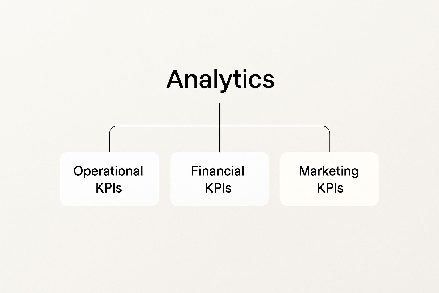
As you can see, a solid analytical framework is what lets you track crucial metrics in operations, finance, and marketing, giving you a clear, unified picture of business health.
The best way to understand these levels is to see them side-by-side. Each one answers a different kind of question, moving from hindsight to foresight.
A Practical Comparison of Data Analytics Types
This table breaks down the four primary types of data analytics, highlighting their core question, purpose, and a practical business example for each.
| Analytics Type | Core Question | Business Purpose | Example |
|---|---|---|---|
| Descriptive | What happened? | To summarize past events and create a snapshot of the business. | A sales dashboard showing total revenue and units sold last quarter. |
| Diagnostic | Why did it happen? | To dig into the data to find the root causes of past outcomes. | Analyzing website traffic data to see why a marketing campaign failed to drive conversions. |
| Predictive | What is likely to happen? | To forecast future trends and outcomes based on historical patterns. | Using customer purchase history to predict which clients are at high risk of churning next month. |
| Prescriptive | What should we do? | To recommend specific actions to achieve a desired goal. | An e-commerce platform automatically adjusting product prices in real-time to maximize profit. |
This table gives you a quick reference, but let's break down what each type really means for your business.
Descriptive Analytics: What Happened?
Descriptive analytics is your starting point, the foundation of everything else. It answers the simple, direct question: "What happened?" This type of analysis looks back at historical data to give you a clear, digestible summary of the past. It's the equivalent of checking your business's vital signs.
You see descriptive analytics every single day. It’s the stuff that fills your business intelligence dashboards, sales reports, and website traffic summaries. The whole point is to organize and present raw data in a way that makes sense.
Common examples include:
- Monthly revenue reports
- Website visitor counts
- Social media engagement metrics
- Inventory levels over the last quarter
While it won't tell you why something happened, it gives you the essential "what"—the critical first step for any deeper analysis.
Diagnostic Analytics: Why Did It Happen?
Once you know what happened, the next logical question is, "Why did it happen?" This is where diagnostic analytics comes in. It picks up where descriptive analytics leaves off, drilling down into the data to uncover the root causes and contributing factors behind an event.
This is the investigative stage. If your descriptive report shows that sales dipped by 15% last month, diagnostic analytics is the process of figuring out why. Was it a new competitor? A failed marketing campaign? A seasonal slump? Or maybe a technical glitch on your e-commerce site?
Diagnostic analytics moves beyond simple reporting and into true analysis. It's the process of connecting the dots between different data points to build a narrative that explains past performance.
Predictive Analytics: What Is Likely to Happen?
With a good handle on what happened and why, you can start looking ahead. Predictive analytics uses historical data, statistical algorithms, and machine learning to forecast what is likely to happen next.
This is where you shift from being reactive to proactive. For instance, by analyzing past customer behavior, a company can predict which customers are most likely to churn in the next month. Retailers use these same models to forecast product demand, helping them keep just the right amount of stock on hand. This is a massive step in advanced analytics and data visualization.
Common applications include:
- Forecasting future sales trends
- Identifying potential equipment failures
- Predicting customer lifetime value
This ability to see around the corner lets organizations get ahead of challenges and jump on opportunities before they fully emerge.
Prescriptive Analytics: What Should We Do?
Finally, we reach the most advanced level: prescriptive analytics. This type goes beyond just predicting the future; it actually recommends specific actions to achieve a goal or head off a risk. It answers the ultimate business question: "What should we do about it?"
If predictive analytics forecasts a 20% spike in website traffic from an upcoming campaign, prescriptive analytics might recommend how to reallocate server resources to prevent a crash or suggest real-time ad spend adjustments to maximize conversions. It uses complex algorithms and business rules to simulate different scenarios and pinpoint the best course of action. This is where data truly begins to drive automated, optimized decision-making.
Choosing the Right Data Visualization Technique

Picking the right data visualization is less about making things look pretty and more about making a clear, powerful point. Think of every chart as an argument. It’s a tool for telling a story with data, and choosing the wrong one can muddy your message or, even worse, lead your audience to the wrong conclusion.
It’s like picking the right tool for a job. You wouldn't use a screwdriver to hammer in a nail. In the same way, you shouldn't use a pie chart to show how a metric has changed over the last year. The secret is matching the chart to the specific story you want the data to tell.
This need for clear data storytelling is fueling massive growth in the industry. The global market for data visualization tools, valued at around USD 4.2 billion, is expected to nearly double to over USD 8.2 billion by 2033. This explosion shows just how vital it is for businesses to translate complex numbers into graphics anyone can understand. You can find more details about this market trend and learn about the industry's direction.
Aligning Your Chart With Your Goal
Before you even touch a design tool, stop and ask yourself one simple question: "What story am I trying to tell?" Your answer is the compass that will point you to the perfect visualization. Are you comparing different products? Showing growth over a quarter? Proving that two variables are connected?
The effectiveness of a visualization is not measured by its beauty, but by its ability to generate understanding. The goal is always clarity, not complexity.
Let's break down the most common data stories and the charts that tell them best.
Showing Comparisons Among Items
When your main goal is to stack different categories up against each other, the classic bar chart is your best friend. Its strength is its simplicity. Anyone can look at it and instantly see which bar is bigger or smaller.
- Vertical Bar Charts: These are perfect for comparing a handful of categories, like sales figures for each of your top five products. The length of the bars makes it dead simple to spot the winner and the loser at a glance.
- Horizontal Bar Charts: Switch to a horizontal layout when you have long category names that would look cramped and unreadable on a vertical axis. They work great for things like comparing the performance of different named marketing campaigns.
A common rookie mistake is trying to cram too many bars onto one chart. If you have dozens of categories, your chart becomes an unreadable mess. Instead, try grouping them into broader categories or just showing the top performers to keep it clean and clear.
Revealing Trends Over Time
To tell the story of how something has changed over a period, the line chart is king. It connects individual data points, creating a clear visual path of growth, decline, or fluctuation. Nothing tells a "before and after" story better.
A line chart is the go-to choice for:
- Tracking monthly revenue: You'll immediately see the peaks and valleys of your business cycle.
- Monitoring website traffic: Spot steady growth or a sudden drop in visitors instantly.
- Observing stock prices: Follow the day-to-day journey of a particular stock.
The slope of the line—whether it’s trending up or down—communicates the core message in a split second. This makes it an essential tool for any analytics and data visualization dashboard focused on historical performance and future forecasting.
Uncovering Relationships and Correlations
What if your goal is to see if two completely different things are connected? This is where the scatter plot comes in. Every single dot on the chart represents one piece of data, placed according to its value for two separate variables.
By looking at the overall pattern of the dots, you can spot potential relationships hiding in plain sight:
- Positive Correlation: As one variable goes up, the other tends to go up too (the dots will form a line slanting upwards).
- Negative Correlation: As one variable goes up, the other tends to go down (the dots will slant downwards).
- No Correlation: The dots are just a random cloud with no obvious pattern.
For example, you could use a scatter plot to see if there's a connection between how much you spend on ads and how many sales you make. It's a powerful way to find the hidden connections that live inside your spreadsheets.
Visualizing Distribution and Concentration
Sometimes, the story isn't about a single trend or comparison but about density and concentration. Heat maps are brilliant for this, using color to represent value. Typically, darker or "hotter" colors show higher values or concentration, while lighter shades show lower values.
A fantastic real-world example is a website heat map showing where visitors click the most. The bright red and orange "hot spots" instantly reveal which parts of your page are getting all the attention. This technique is also used for everything from showing real estate prices in different neighborhoods to visualizing risk across a financial portfolio. The immediate visual impact makes complex data easy to digest.
Finding the Best Tools for Your Data Needs
Choosing the right tool for analytics and data visualization can feel a lot like walking into a massive hardware store. You’re surrounded by options, from simple hand tools to complex power machinery, and every single one claims to be the best. The secret isn't finding the one "best" tool, but the right tool for your specific job, your team's skills, and your long-term goals.
The software landscape is exploding for one simple reason: businesses are desperate for clear insights from their data. The market for data visualization tools, valued at around USD 10.92 billion, is expected to skyrocket to USD 18.36 billion by 2030, according to recent market research. This growth is all about moving away from stale, static reports and embracing dynamic, graphical ways to actually explore data. You can explore more data about this rapid market expansion to see what it means for businesses.
This huge demand has split the tool ecosystem down two main paths: user-friendly platforms and code-driven libraries.
User-Friendly Platforms for Rapid Insights
For most businesses, the fastest way to get from a messy spreadsheet to a beautiful, interactive dashboard is with a user-friendly platform. These tools are built with drag-and-drop interfaces, letting analysts, marketers, and managers build powerful visuals without touching a single line of code.
Think of them as high-end, pre-built workbenches. They come fully equipped with everything you need to connect to data sources, create charts, and share your findings securely.
Key players in this space include:
- Tableau: Often praised for its stunning visual outputs and intuitive feel. It’s fantastic for creating polished, shareable dashboards that are easy for non-technical folks to dig into.
- Microsoft Power BI: A true powerhouse, especially for companies already living in the Microsoft world. Its tight integration with tools like Excel and Azure makes it a natural fit for many corporate environments.
- Google Looker Studio: A free and incredibly accessible tool, perfect for visualizing data from Google products like Analytics, Ads, and Sheets. It's a great starting point for small businesses and marketing teams.
The biggest win with these platforms is speed and accessibility. You can turn a confusing spreadsheet into a clear, interactive dashboard in a matter of hours, not weeks. This opens up data analysis to a much wider audience inside your organization.
Code-Driven Libraries for Ultimate Flexibility
On the other side of the spectrum, you have code-driven libraries. These aren’t standalone programs but toolkits designed for programming languages like Python and JavaScript. Instead of dragging and dropping, you build your visualizations by writing code.
This approach is like building your own custom workbench from scratch. It takes more technical skill and effort, but the trade-off is almost limitless flexibility. You aren't stuck with the features of a pre-built platform; if you can code it, you can build it.
Popular code-driven options include:
- Matplotlib & Seaborn (Python): These are the bedrock libraries for data visualization in Python. Matplotlib gives you fine-grained control over every pixel of a plot, while Seaborn lets you create beautiful statistical charts with much less code.
- D3.js (JavaScript): This is the gold standard for web-based data visualization. D3.js gives you the power to create highly custom, interactive, and animated graphics that can be embedded right into websites and apps.
Taking this path requires a developer's mindset, but it unlocks the ability to create truly unique data experiences that go far beyond standard dashboards. It’s the route favored by data scientists, developers, and organizations that need to bake bespoke visuals directly into their own products.
Ultimately, the best tool is the one that helps you turn your numbers into a clear, compelling story.
Best Practices for Effective Data Storytelling

A great visualization does more than just show numbers; it tells a story. This is the final, and most important, step in the entire analytics and data visualization process. Moving from a simple chart to a narrative that actually persuades people requires a thoughtful approach built on clarity, context, and a deep understanding of your audience.
Effective data storytelling is all about guiding your audience through your findings so they see the insights exactly as you do. It’s the difference between handing someone a list of ingredients versus serving them a perfectly cooked meal. Every single element has to be chosen with purpose.
Know Your Audience and Your Goal
Before you even think about opening a design tool, you have to know who you're talking to and what you want them to do. Are you presenting to executives who just need the high-level summary? Or are you talking to fellow analysts who want to get into the weeds? The answer will completely change your approach.
Your goal is just as critical. Are you trying to secure funding for a new project, shine a light on a problem, or celebrate a big win? Every design choice—from the type of chart you pick to the colors you use—should serve that one clear objective. This focus is what keeps your visual from becoming a confusing data dump.
Declutter for Maximum Impact
One of the most common mistakes I see is cramming too much noise into a single chart. Unnecessary gridlines, distracting 3D effects, and way too many labels all fight for attention, completely drowning out your message. The goal is to get the highest possible data-to-ink ratio.
Think like a minimalist designer. If it doesn't directly support the story, get rid of it.
- Remove redundant labels: If your axis is clearly marked, you don't need to label every single point on the line.
- Mute gridlines: Make them a light gray or just remove them entirely if they aren't essential for comparing values.
- Avoid visual gimmicks: Stick to clean, 2D charts. There's almost never a good analytical reason to use 3D effects.
This decluttering process forces your audience to focus on what actually matters: the insights hidden in the data. It makes your argument stronger and far more memorable.
A visualization is not done when there is nothing left to add, but when there is nothing left to take away. This principle ensures every element on the screen serves a specific purpose, guiding the viewer directly to the intended insight without distraction.
Use Color with Clear Purpose
Color is an incredibly powerful tool, but it should be used strategically, not just to make things look pretty. When used correctly, color can highlight key information, define categories, and guide the viewer's eyes exactly where you want them to go. Used poorly, it just creates a mess.
Establish a clear color hierarchy. Use a neutral color like gray for your baseline data, and then pick a single, bright, contrasting color to draw immediate attention to your most important finding. For a deeper dive, exploring data visualization best practices can offer more valuable techniques for using color and other design elements effectively.
Provide Essential Context
Finally, remember that a chart without context is just a pretty picture. Your audience needs a frame of reference to understand what they're looking at and, more importantly, why it matters. This is where titles, annotations, and short descriptions become your best friends.
A strong title should read like a headline that summarizes the main takeaway, not a generic label. For example, "Q3 Sales Soared by 25% After New Campaign Launch" is worlds better than just "Q3 Sales Data." Use annotations to call out specific data points or trends that are critical to your story. By weaving these elements together, you transform a static chart into a dynamic and persuasive narrative.
Building a Data-Driven Culture That Lasts
Even the most powerful analytics and data visualization tools will fall flat if they aren’t part of a bigger cultural shift. Real success isn’t about a fancy new dashboard; it’s about creating an environment where data-backed decisions are the default for everyone, from marketing all the way to the executive suite. This is a change in mindset, not just a change in software.
The goal is to stop relying on gut feelings and start trusting the evidence. That journey begins by making data easy to access and even easier to understand. When people see for themselves how data makes their jobs simpler and leads to better results, they become the biggest champions of the new way forward. It’s a slow burn, built on trust and proven value.
Start Small to Win Big
Trying to force a massive, company-wide data revolution overnight is a surefire way to fail. A much smarter approach is to kick things off with small projects that can deliver a big impact. Find one nagging business problem that data can solve, focus your efforts on it, and deliver a clear, measurable win.
That first victory is what builds momentum. It becomes a powerful case study for the rest of the company, proving that analytics isn’t just some abstract idea—it’s a practical tool for solving real-world challenges.
A data-driven culture is not built overnight. It grows from a series of small wins that demonstrate the power of evidence-based decision-making, gradually earning buy-in and inspiring wider adoption across all departments.
These early successes have a ripple effect. Soon, other teams will start asking how they can use data in their own work. This kind of organic adoption is far more sustainable than any top-down mandate.
Democratize Data and Foster Literacy
For a data-driven culture to really take root, information can’t be locked away in silos that only analysts can access. It has to be democratized. This means giving teams user-friendly tools and dashboards that let them dig into the data that’s actually relevant to their roles.
But just giving people access isn't enough; you also have to build data literacy. This means training employees on how to actually read charts, ask the right questions of the data, and interpret the findings correctly. To make this stick, it’s crucial to focus on actionable insights like key user retention metrics, which tie data directly to business growth.
This empowerment turns employees from passive data consumers into active participants in the whole process, creating a shared language around what success looks like. The market for visualization tools is already reflecting this shift, with North America leading the charge due to its high adoption of new tech. In the U.S., small and medium-sized businesses are fueling this demand as they produce huge amounts of data that need to be visualized for quick, real-time decisions. You can read more on these regional market dynamics to see where the trend is headed. By championing both access and education, you create a lasting foundation for a smarter, more agile organization.
Common Questions About Data Analytics and Visualization
As you dive deeper into analytics and data visualization, you'll find that a few key questions pop up again and again. It doesn't matter if you're just starting out or you've been doing this for years; getting straight answers is the fastest way to build confidence and sharpen your skills.
Let's break down some of the most common ones.
Analytics Versus Visualization: What Is the Difference?
Think of it like a detective story. Data analytics is the entire investigation—finding clues, connecting the dots, and figuring out the "whodunit" hidden in your numbers. It's the whole process of turning raw information into a real, tangible insight.
Data visualization, on the other hand, is presenting the solution to the jury. It's the final report, the visual summary that makes the findings of the investigation crystal clear to everyone, no matter their technical background. One is the discovery; the other is the storytelling.
Analytics finds the "what" and the "why" in your data. Visualization communicates those findings in a way that is fast, intuitive, and easy to act upon. You need both to turn data into meaningful business decisions.
Is Coding a Requirement for Visualization Tools?
Not at all. While coding libraries like D3.js give developers incredible power to create custom visuals, most of the big-name platforms today are built for people who don't code.
Tools like Tableau, Microsoft Power BI, and Google Looker Studio are designed around intuitive drag-and-drop interfaces. They empower business users, marketers, and analysts to build stunning, interactive dashboards without ever touching a line of code.
How Do I Pick the Right Chart for My Data?
The easiest way to pick the right chart is to start with the story you want to tell. Your goal should always drive the visualization technique, not the other way around. For a deeper look at how large organizations use data to shape their strategy, this article on Enterprise Data Analytics offers some great perspective.
Here's a quick guide to get you started:
- To compare values: A bar chart is your best friend. It’s perfect for showing the difference between categories.
- To show a trend over time: Use a line chart. Nothing shows growth, decline, or fluctuations more clearly.
- To explain parts of a whole: A pie chart or stacked bar chart works well to show composition.
- To find a relationship between numbers: Go with a scatter plot to see if two variables might be connected.
At KP Infotech, we specialize in transforming your complex data into clear, actionable insights that drive growth. Our team builds custom analytics solutions and intuitive dashboards that empower you to make smarter, data-driven decisions with confidence.
Ready to unlock the full potential of your business data? Learn how our development and analytics services can help you at https://kpinfo.tech.