

In a data-saturated world, presenting raw numbers is insufficient. The ability to transform complex datasets into compelling, understandable visuals is a critical skill, turning abstract figures into actionable intelligence. Effective data visualisation does more than just display information; it tells a story, reveals hidden patterns, and empowers decisive action. However, the line between an insightful chart and a confusing graphic is incredibly fine. Common pitfalls like misleading scales, poor chart choices, or visual clutter can quickly undermine your message, leading to incorrect interpretations and flawed business decisions.
This guide moves beyond generic advice to provide a clear framework for excellence. We will explore seven foundational data visualisation best practices designed to elevate your charts from mere decoration to powerful communication tools. These principles are essential for ensuring your insights are not only seen but truly understood. By mastering these techniques, you can create visuals that are accurate, accessible, and immediately impactful. This article provides a direct roadmap to help you avoid common mistakes and consistently produce graphics that drive clarity and informed decision-making across your organisation. We will cover everything from choosing the right chart and maintaining visual hierarchy to providing clear context and ensuring your data tells a compelling, truthful story.
1. Choose the Right Chart Type
The foundation of any effective data visualisation is selecting a chart type that accurately represents the data and clearly communicates the intended message. Just as a carpenter chooses a specific tool for a specific task, a data professional must choose the right chart for the story they want to tell. The wrong choice can not only confuse your audience but actively mislead them, obscuring critical insights or creating false impressions. This practice is fundamental to data visualization best practices, ensuring clarity and impact.
Why Chart Selection is Crucial
Different chart types are engineered to highlight specific relationships within a dataset. A bar chart excels at comparing distinct categories, a line chart is unparalleled for showing trends over time, and a scatter plot reveals relationships between two variables. Choosing inappropriately, for example, using a pie chart to show a trend over several years, breaks the visual logic and forces the viewer to work harder to understand the information.
Consider the annual Spotify Wrapped campaign. It masterfully uses simple vertical bar charts to let users compare their most-listened-to artists and songs. The discrete bars make rank and volume differences immediately obvious. Similarly, weather applications use line charts for temperature forecasts because they intuitively map the continuous flow of time to a continuous line, showing peaks and troughs throughout the day.
Actionable Tips for Chart Selection
To ensure you’re making the right choice, start by defining the primary question you want your visualisation to answer.
- For Comparisons: Use bar or column charts. They are excellent for comparing values across different categories. A key tip is to avoid using a pie chart when you have more than five categories, as distinguishing between small slices becomes difficult.
- For Trends Over Time: Line charts are the standard. They effectively show the rise and fall of a value over a continuous period, like monthly sales figures or website traffic.
- For Parts of a Whole: A pie or donut chart can be effective, but only for a small number of categories that clearly sum to 100%. If precise comparison is needed, a stacked bar chart is often a better alternative.
- For Distribution: Histograms and box plots are ideal for showing how data points are clustered and spread across a range.
“The greatest value of a picture is when it forces us to notice what we never expected to see.” – John Tukey, Mathematician
Avoid using 3D charts unless the third dimension adds meaningful, understandable data. Often, it just adds visual clutter that distorts perception, a concept heavily criticised by pioneers like Edward Tufte.
This quick reference summarises the core functions of the three most common chart types.
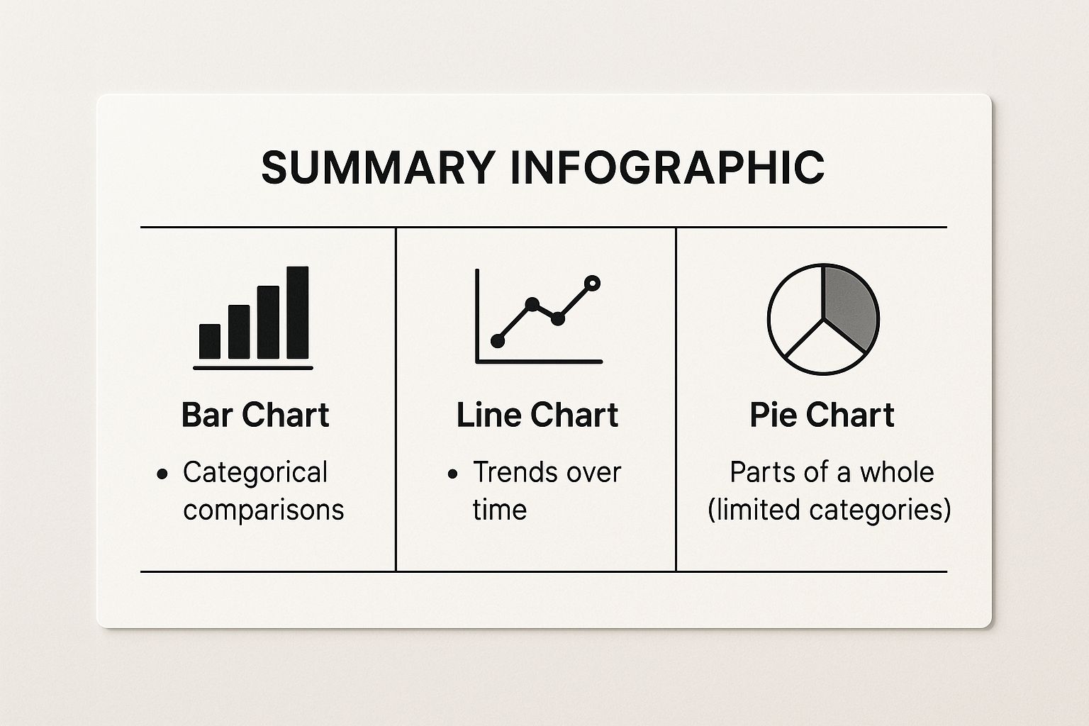
As the infographic illustrates, matching the chart’s function-comparison, trend analysis, or composition-to your data’s story is the critical first step.
2. Maintain Visual Hierarchy and Focus
Once you have the right chart, the next step is to guide your audience’s eyes to the most critical information first. Effective visualisations use a clear hierarchy to create a path for the viewer, ensuring the main message is absorbed instantly. By strategically using elements like colour, size, and position, you can control the narrative, prevent overwhelm, and make your data story more impactful. This practice is essential among data visualisation best practices for turning a cluttered chart into a clear, compelling insight.
Why Visual Hierarchy is Crucial
Without a deliberate hierarchy, viewers are left to wander through a visualisation, unsure of what is most important. This can lead to misinterpretation or, worse, cause them to disengage entirely. A strong visual hierarchy acts as a tour guide, pointing out the main attractions before delving into the finer details. It organises information logically, making complex datasets feel intuitive and accessible.
Consider a financial dashboard. Key performance indicators (KPIs) like revenue or profit are often displayed in the largest font and a bold, contrasting colour at the top. Supporting metrics are presented in smaller text and more muted tones below. This design immediately tells the executive what they need to know, while still providing context. Similarly, election result maps use bright, saturated colours for critical swing states to draw immediate attention to the most decisive areas.
Actionable Tips for Creating Hierarchy
To build an effective visual hierarchy, start by identifying the single most important takeaway you want your audience to have.
- Use the 5-Second Rule: A viewer should be able to understand the main insight of your visualisation within five seconds. If they can’t, your hierarchy needs refinement.
- Leverage Size and Weight: Make titles, key numbers, and important labels the largest and boldest text elements on the page. The most significant data points should be visually dominant.
- Be Strategic with Colour: Limit your use of bright, attention-grabbing colours to just one or two. Use them to highlight the most crucial data points, while using greys or muted tones for secondary information and context.
- Prioritise Positioning: Western audiences read from top-to-bottom and left-to-right. Place your most important information in the top-left quadrant of your visualisation to ensure it’s seen first.
“The purpose of visualization is insight, not pictures.” – Ben Shneiderman, Computer Scientist
Pioneers like Edward Tufte and Stephen Few have long advocated for designs that prioritise clarity. By directing focus, you ensure your audience not only sees the data but understands the story it tells.

As shown in the image, a well-organised layout makes the most critical information impossible to miss, fulfilling the primary goal of any data visualisation.
3. Ensure Accessibility and Inclusivity
An effective data visualisation communicates insights to everyone, regardless of their physical or cognitive abilities. Ensuring accessibility means designing charts and graphs that are usable by people with disabilities, such as colour blindness or other visual impairments. This practice is not just a matter of compliance; it is a core component of ethical and effective communication, broadening your audience and often improving clarity for all viewers. Upholding these data visualisation best practices ensures your message is truly universal.
Why Accessibility is Crucial
Data that cannot be perceived cannot be understood. A significant portion of the population has some form of colour vision deficiency, making common red-green palettes incomprehensible. Designing without considering accessibility excludes these individuals from grasping key insights, rendering your hard work ineffective for them. Prioritising inclusivity ensures that critical information, from public health data to business intelligence dashboards, is available to the widest possible audience.
Consider the widespread adoption of the Viridis colour palette in scientific journals and programming languages like Python. It was specifically engineered to be perceptually uniform and clear for viewers with all forms of colour blindness. Similarly, news organisations like the BBC have developed accessible colour standards for their data graphics, ensuring their reporting on complex topics like election results or economic trends can be understood by their entire readership.
Actionable Tips for Accessible Design
To build inclusive visualisations, integrate accessibility checks directly into your design workflow.
- Use Colour-Blind-Friendly Palettes: Start with palettes designed for accessibility. Tools like ColorBrewer and Viz Palette help you select and test combinations that remain distinct for people with various types of colour vision deficiency.
- Don’t Rely Solely on Colour: Reinforce visual encoding with other elements. Use patterns, textures, labels, or varied shapes to differentiate data categories. This provides multiple ways to interpret the information.
- Ensure Sufficient Contrast: Text and important visual elements must stand out from the background. Adhere to Web Content Accessibility Guidelines (WCAG) and aim for a minimum contrast ratio of 3:1 for graphical elements and 4.5:1 for text.
- Provide Alternatives: Where possible, include a data table alongside a complex chart. This allows users who rely on screen readers or prefer tabular data to access the underlying information directly.
“The power of the Web is in its universality. Access by everyone regardless of disability is an essential aspect.” – Tim Berners-Lee, Inventor of the World Wide Web
By making accessibility a standard step in your creation process, you create more robust, professional, and impactful visualisations that serve every member of your audience.
4. Provide Context and Clear Labeling
A visualisation, no matter how beautiful, fails if the audience does not understand what they are looking at. Providing clear labels and sufficient context is not an optional extra; it is a core component of effective communication. This practice involves adding all the necessary explanatory elements, such as titles, axis labels, legends, and source notes, so the chart can stand on its own and tell a complete, accurate story. This is a non-negotiable step in applying data visualisation best practices.
Why Context is Crucial
Without context, data is just a collection of numbers. A chart showing a line trending upwards is meaningless without knowing what the line represents, what the axes measure, or the time frame involved. Context transforms raw data into actionable information by giving the viewer a frame of reference to interpret its significance. It answers the fundamental questions of what, where, when, and how, preventing misinterpretation and building trust with your audience.
Consider the detailed charts from outlets like FiveThirtyEight or the Financial Times. Their visualisations on election forecasts or global trends are always accompanied by clear titles that state the key finding, meticulously labelled axes with units, and notes explaining their methodology or data sources. This transparency allows the viewer to understand not just the conclusion but also the evidence supporting it.
Actionable Tips for Labelling and Context
To ensure your visualisations are self-explanatory and insightful, methodically add layers of context.
- Write Titles as Findings: Instead of a generic title like “Monthly Sales”, use a descriptive title that summarises the key insight, such as “Sales Grew 15% in Q3, Driven by New Product Launch”.
- Always Label Axes with Units: Clearly state what each axis measures and include the units, for example, “Revenue (in millions of £)” or “Customer Satisfaction (%)”.
- Use Annotations for Key Events: If a specific event caused a spike or dip in your data, add a brief note directly on the chart to explain it. This prevents viewers from drawing incorrect conclusions.
- Include Data Sources and Sample Sizes: For credibility, always cite where your data came from. If using survey data, mentioning the sample size (e.g., n=1,052) helps the audience assess its reliability.
- Add Reference Lines: Incorporate lines for averages, targets, or historical benchmarks. These reference points give immediate context to the data being presented, showing whether performance is good, bad, or average.
“If you can’t explain it simply, you don’t understand it well enough.” – Albert Einstein
This principle is at the heart of clear labelling. The goal is to remove all ambiguity, guiding your audience directly to the intended insight without requiring external explanation. By making your charts self-sufficient, you empower your audience to understand and trust your data story.
5. Start with Zero and Avoid Misleading Scales
The integrity of a data visualisation rests on an honest representation of the numbers. One of the most common ways this trust is broken, often unintentionally, is through the manipulation of the y-axis scale. Starting a bar chart at a value other than zero, or using an inconsistent scale, can dramatically exaggerate differences and mislead the audience. This practice of maintaining a true and consistent scale is fundamental to ethical data visualisation best practices.
Why a Zero Baseline is Crucial
Bar and column charts represent quantities through their length or height. Our brains instinctively compare the relative sizes of these bars to understand the magnitude of difference. When the baseline is not zero, this visual comparison becomes deceptive. A small difference can be made to look enormous, creating a false narrative. This is known as a truncated axis and is a frequent source of data misinterpretation.
Consider a dashboard comparing monthly sales figures. If one month’s sales are £100,000 and the next is £105,000, a chart with a y-axis starting at £95,000 would make the second bar appear dramatically taller than the first, suggesting a massive performance jump rather than a modest 5% increase. Conversely, always showing survey results on a full 0-100% scale ensures that a score of 75% is visually represented as three-quarters of the total possible, maintaining its true context.
Actionable Tips for Accurate Scaling
To ensure your visualisations are truthful, your primary goal is to represent proportions accurately.
- For Comparisons of Magnitude: Always start the y-axis of a bar or column chart at zero. The entire value is encoded by the bar’s length, and truncating it breaks this visual logic.
- For Trends Over Time: Line charts do not always need to start at zero. Here, the focus is on the relative change and slope of the line, so adjusting the axis to zoom in on the fluctuation can be acceptable, as long as the context is clear.
- Mark Scale Breaks Clearly: If you must use a non-zero baseline or a scale break for compelling reasons, make it explicitly clear to the viewer with a visible axis break symbol or a note.
- Maintain Consistent Scales: When comparing multiple charts of the same metric (e.g., sales by region), use the same scale on all of them. This allows for fair and easy comparison between the different charts.
“A graphic does not distort if the visual representation of the data is consistent with the numerical representation.” – Edward Tufte
Pioneers like Edward Tufte have long championed the principle of “graphical integrity,” where the visualisation must tell the truth about the data. Adhering to proper scaling is a core tenet of this principle, ensuring your visualisations inform rather than deceive.
6. Optimise for Your Audience and Context
An effective data visualisation is not created in a vacuum; it is designed for a specific viewer in a specific context. Tailoring your design, complexity, and presentation style to the intended audience is a critical practice. A visualisation that enlightens an expert data analyst could completely overwhelm a general manager. This user-centric approach ensures your message resonates, is understood, and drives the desired action, making it one of the most vital data visualisation best practices.
Why Audience and Context Matter
The success of a visualisation is measured by its ability to communicate information effectively to its target audience. An executive looking at a dashboard needs high-level Key Performance Indicators (KPIs) for quick decisions, not granular data breakdowns. In contrast, a data scientist requires an interactive tool to explore nuances and test hypotheses. Ignoring this distinction leads to disengagement and confusion, rendering your hard work useless.
Consider the difference between medical charts in a research journal versus those in a patient education pamphlet. The former uses dense, technical visualisations for an expert audience, while the latter uses simplified graphics and clear language to inform the public. Similarly, a data story designed for a mobile-first social media audience will prioritise vertical layouts and concise annotations, unlike a detailed report intended for a desktop screen.
Actionable Tips for Audience-Centric Design
To ensure your visualisation hits the mark, you must first understand who you are designing for and where they will be viewing it.
- Define Your Audience: Are they experts, managers, or the general public? Conduct simple interviews or create user personas to understand their data literacy, goals, and needs.
- Consider the Viewing Context: Will your visualisation be part of a live presentation, embedded in an email, or viewed on a mobile device? Design for the primary use case first, ensuring it is legible and functional in that environment.
- Adjust Complexity Accordingly: Provide high-level summaries for decision-makers and allow experts to drill down for more detail. This concept, known as progressive disclosure, prevents overwhelming novice users while still serving advanced ones.
- Test with Real Users: Before finalising, share a draft with a few members of your target audience. Their feedback is invaluable for identifying points of confusion or missed insights.
“The purpose of visualization is insight, not pictures.” – Ben Shneiderman, Computer Scientist
By deeply considering the end-user, you move beyond just presenting data to creating a genuinely useful communication tool. For a holistic approach to presenting information, further explore how user experience design best practices can inform your visualisation strategy, ensuring your data is not only accurate but also engaging.
7. Tell a Clear Story with Data
Beyond simply presenting data, the most impactful visualisations guide the audience through a compelling narrative. Structuring your data presentation with a clear beginning, middle, and end transforms raw numbers into a memorable story that explains not just what the data shows, but why it matters. This narrative approach makes complex information digestible and drives home the core message, a key element of advanced data visualisation best practices.

Why Storytelling is Crucial
A story provides context and emotional connection, making insights more relatable and actionable. It creates a logical flow that prevents the audience from getting lost in the data, ensuring they follow your intended path of discovery. Without a narrative, even a well-designed chart can feel like an isolated fact, leaving the viewer to wonder about its significance.
Consider the legendary TED talks by Hans Rosling, where he used Gapminder’s animated bubble charts to narrate decades of global development. He didn’t just show the data; he told the story of nations moving from “poor and sick” to “rich and healthy”. Similarly, publications like The Pudding build entire data-driven articles around a central narrative, exploring cultural topics in a way that is both informative and deeply engaging. This method turns data from a passive report into an active experience.
Actionable Tips for Data Storytelling
To craft a powerful data narrative, think like a storyteller and guide your audience from one insight to the next.
- Establish a Clear Arc: Start with the most critical insight or a compelling question (the beginning), present the supporting data and context (the middle), and conclude with a key takeaway or call to action (the end).
- Guide the Viewer: Use annotations, labels, and colour strategically to highlight key points in your visualisation, directing the audience’s attention and explaining the “so what” behind the data.
- Build the Narrative: Reveal information progressively. Instead of showing everything at once, build your chart or presentation step-by-step to create suspense and ensure each new piece of information is understood before adding the next.
- Connect to Human Impact: Whenever possible, frame the data in human terms. An annual report, for instance, can connect financial performance figures directly to strategic business decisions and their real-world outcomes.
“Data are just summaries of thousands of stories – tell a few of those stories to help make the data meaningful.” – Chip & Dan Heath, Authors of “Made to Stick”
By focusing on the story, you ensure your visualisation does more than just inform; it persuades, inspires, and prompts action. This narrative-driven approach is what separates good data visualisations from truly great ones.
7 Key Data Visualization Best Practices Comparison
| Item | Implementation Complexity 🔄 | Resource Requirements ⚡ | Expected Outcomes 📊 | Ideal Use Cases 💡 | Key Advantages ⭐ |
|---|---|---|---|---|---|
| Choose the Right Chart Type | Moderate – requires data understanding | Moderate – knowledge of chart types | Clear, accurate data interpretation | Data exploration, comparisons, trend analysis | Maximizes comprehension speed, reduces cognitive load |
| Maintain Visual Hierarchy and Focus | Moderate – needs design skills | Low to Moderate – styling resources | Faster insight, guided viewer attention | Dashboards, reports, presentations | Enhances focus, creates polished appearance |
| Ensure Accessibility and Inclusivity | High – requires design & dev effort | High – testing tools & design adaptations | Broader audience reach, legal compliance | Public-facing visuals, diverse audiences | Improves clarity and inclusivity |
| Provide Context and Clear Labeling | Moderate – requires subject expertise | Moderate – time for research & annotation | Self-explanatory visuals, builds trust | Analytical reports, academic and media visuals | Enables proper interpretation, reduces confusion |
| Start with Zero and Avoid Misleading Scales | Moderate – careful scale selection | Low to Moderate – design adjustments | Honest, trustworthy visuals | Quantitative charts, financial data, comparisons | Maintains data integrity, prevents misinterpretation |
| Optimize for Your Audience and Context | High – requires deep audience research | High – possibly multiple versions | Increased engagement and comprehension | Tailored communication, multi-platform delivery | Maximizes relevance and impact |
| Tell a Clear Story with Data | High – requires narrative & editorial skills | Moderate – design and storytelling resources | Improved memorability, motivated action | Data storytelling, presentations, reports | Guides audience through insights, emotional connection |
Putting These Principles into Practice
Mastering the art and science of data visualisation is an ongoing journey, not a final destination. We have explored a series of foundational pillars designed to elevate your charts and graphs from mere decoration to powerful communication tools. By consistently applying these data visualization best practices, you build a reliable framework for clarity, credibility, and impact in every project you undertake.
The path to effective visualisation begins with choosing the right chart type for your data and your message. It is reinforced by establishing a clear visual hierarchy that guides your audience’s attention to what truly matters. We’ve also seen how crucial it is to design for accessibility, ensuring your insights are available to everyone, and to provide complete context through clear labelling and annotations, which prevents ambiguity.
Ultimately, the integrity of your work rests on an honest presentation of the facts. Adhering to principles like starting your axis at zero and avoiding misleading scales is non-negotiable for building trust. Likewise, tailoring your design and complexity to your specific audience and their context ensures your message resonates and is properly understood. When all these elements work in harmony, you can achieve the ultimate goal: telling a compelling story that transforms raw data into actionable knowledge. For a deeper dive into practical application and future trends, explore this guide on 8 Essential Data Visualization Best Practices for 2025 which offers further perspectives on refining your approach.
The value of mastering these concepts extends far beyond creating attractive reports. For entrepreneurs and small businesses, clear data visualisation can illuminate operational inefficiencies and highlight growth opportunities. For established enterprises, it is the bedrock of strategic decision-making, enabling teams to understand complex systems and automate processes with confidence. Effective data visualisation democratises information, aligning teams around shared goals and empowering them to act on data-driven insights. It is the bridge between raw information and strategic action.
Adopting these data visualization best practices will fundamentally change how you communicate. You will move from presenting numbers to delivering narratives, from showing data points to revealing insights. This is how you transform your organisation’s data from a passive resource into an active, strategic asset that drives progress, fosters innovation, and delivers a tangible competitive advantage.
Ready to transform your company’s raw data into strategic, actionable insights? KP Infotech specialises in developing custom enterprise solutions and digital platforms with powerful, integrated data visualisation capabilities. Contact us to discover how we can help you build bespoke dashboards and systems that bring your data to life and drive your business forward.