

Designing a web application isn't just about slapping together some code and a pretty interface. It's a thoughtful journey that starts with a raw idea and transforms it into a functional, user-friendly digital product. This whole process is built on a foundation of strategic planning, thorough research, and iterative design.
Laying a Rock-Solid Foundation for Your Web App

Before a single pixel gets placed or a line of code is written, the most important work happens. This initial "discovery phase" is where you nail down clear business goals and align them with real user needs, creating a blueprint for success. Skipping this step is like trying to build a house without a foundation—it’s pretty much guaranteed to fail.
The whole thing kicks off with stakeholder interviews. You need to get to the heart of the business problem the app is supposed to solve. What are the key performance indicators (KPIs)? What does success look like in six months? A year? Answering these questions gives you the "why" behind the entire project.
Uncovering Gaps in the Market
Next, it's time for a deep dive into the competitive landscape. Analysing what your competitors are doing isn't about copying their features. It’s about spotting their strengths, their weaknesses, and, most importantly, the gaps in what they offer. This is where you find your unique value.
For instance, if you're building a project management tool, you might find that the existing solutions are powerful but way too complex for small teams. That insight right there is your market opportunity: a simpler, more intuitive tool that people will actually want to use.
A well-defined problem is a problem halfway solved. The discovery phase is your chance to define that problem with absolute clarity, ensuring you're building a "must-have" product, not just another "nice-to-have."
This initial discovery phase is crucial for grounding your project in reality. The table below breaks down the core activities involved and why each one matters.
Core Components of a Project Discovery Phase
| Activity | Primary Goal | Key Outcome |
|---|---|---|
| Stakeholder Interviews | Understand core business objectives and success metrics. | A clear vision of the "why" behind the project. |
| Competitor Analysis | Identify market strengths, weaknesses, and opportunities. | A unique value proposition that sets your app apart. |
| Market Research | Validate demand and uncover unmet user needs. | A data-backed understanding of the target audience. |
| Technical Assessment | Evaluate feasibility and identify potential constraints. | Initial recommendations for a suitable technology stack. |
By the end of this phase, you should have a solid grasp of what you're building, for whom, and why it's a better solution than what's already out there.
The All-Important Project Brief
All this initial research culminates in a project brief. This document is way more than a formality; it's the single source of truth that keeps the entire team aligned and moving in the same direction. It should clearly outline:
- Project Goals: The specific, measurable outcomes the web app needs to achieve.
- Target Audience: Detailed descriptions of your primary users and their pain points.
- Scope and Features: A high-level list of what the app will do (and just as importantly, what it won't).
- Technical Considerations: Initial thoughts on technology stacks and any constraints. Choosing the right tools early is vital, and our guide on the best web application frameworks can offer some valuable direction.
This disciplined approach ensures everyone—from designers to developers—is working towards the same vision. The global development scene is constantly shifting. By 2025, India is expected to become the world's largest software development nation, with over 70% of new applications using no-code or low-code technologies to speed things up. This trend just highlights how crucial a solid, well-defined plan is for guiding efficient development from day one.
Getting Inside Your Users' Heads

Designing a web application in a vacuum is a recipe for disaster. It doesn't matter how visually stunning your interface is if it doesn't solve a real problem for the people who are actually meant to use it. This stage is all about empathy—stepping out of your own shoes and seeing the world through your users' eyes.
The foundation for this is solid user research. This isn't just about asking people if they like the colour of a button. It's a deep dive into their motivations, frustrations, and daily workflows. To really get inside your users' heads and figure out what they need, it's essential to learn how to conduct user research that drives results.
Creating Realistic User Personas
Once you've started gathering data, you need to turn it into something tangible. This is where user personas come in. These aren't just generic profiles; they are detailed, fictional characters built from your research that represent your key user segments.
A good persona should include:
- Demographics: Age, location, and professional role.
- Goals: What are they trying to achieve in their day-to-day life or work?
- Motivations: What's driving them to look for a solution like yours?
- Frustrations: What obstacles or pain points are they running into with their current tools?
For example, instead of a vague "small business owner," you create "Ravi, a 34-year-old café owner in Mumbai who is fed up with complicated inventory software and needs a simple way to track stock on his tablet." This level of detail makes your target user feel like a real person, which helps guide every single design decision you make down the line.
Mapping The User Journey
With your personas clearly defined, you can start mapping out their entire experience with your future application. A user journey map is a visual story of the path a user takes to accomplish a goal. It details every touchpoint, from the moment they first realise they have a problem to the point where they become a regular user of your product.
The real value of a user journey map isn't in charting a perfect path; it's in identifying the potholes and roadblocks. Pinpointing moments of friction allows you to design a smoother, more intuitive experience before a single line of code is even written.
This process transforms abstract user needs into a concrete direction for your design. The insights you gain from personas and journey maps feed directly into your feature list, making the entire requirements gathering process much more effective. If you want to go deeper, exploring different requirements gathering techniques can give you a more structured framework for this critical phase.
Understanding user behaviour is especially important in fast-moving markets. For instance, mobile app development in India is exploding, with over 28 billion downloads in 2023 alone. This digital-first mindset shows that users expect intuitive, mobile-centric solutions—a key insight for anyone designing a web application for this audience.
Bringing Your Ideas to Life with Prototypes
This is where the magic really starts to happen. All that abstract research and planning finally begins to look and feel like a real product. Prototypes are the bridge between a great idea and a functional application, letting you test flows, layouts, and interactions long before a single line of code gets written.
Think of it as building a detailed architectural model before pouring the foundation for a house. You wouldn't skip that step in construction, and you definitely shouldn't skip it here. Getting this phase right saves a shocking amount of time and money by catching clunky design choices and usability problems early on.
Starting with Low-Fidelity Wireframes
The first move is almost always a low-fidelity wireframe. Seriously, forget about colours, fancy fonts, or branding at this point. The only thing that matters right now is structure, layout, and the hierarchy of your content. A wireframe is just a basic visual guide—the skeleton of your application.
This simple, block-based approach lets you quickly map out different screens and how a user moves between them. It forces you to answer the most fundamental questions first:
- Where does the main navigation need to live?
- What's the single most important thing on the dashboard?
- How does a user get from the sign-up screen to finishing their first key task?
Tools like Balsamiq are great for this, but honestly, a simple pen and paper or a whiteboard works just as well. The goal here is speed and clarity, not a piece of art. Nailing this early blueprint gets the whole team aligned on the core structure from the get-go.
The most common mistake I see teams make is jumping straight into beautiful, high-fidelity designs. Low-fidelity wireframes force you to obsess over the user experience first, making sure the foundation is rock-solid before you start painting the walls.
Building Interactive Prototypes
Once everyone agrees on the structural blueprint, it's time to add a layer of interactivity. An interactive prototype is designed to simulate the real user experience, making the static screens feel like a working piece of software. Users can actually click buttons, navigate around, and interact with different elements.
This step transforms a collection of static images into a dynamic and powerful testing tool. The infographic below shows the high-level process that feeds into this prototyping stage, reminding us that it all starts with solid requirements.
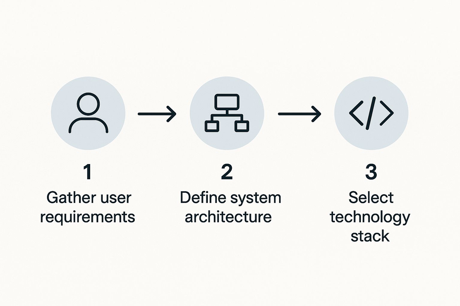
This just hammers home the point: a prototype is only as good as the user needs and system structure it's built upon.
For this part of the process, tools like Figma, Adobe XD, and Axure are the industry heavyweights. Figma is absolutely brilliant for its real-time collaboration and speed, while Axure can handle incredibly complex logic for those high-stakes, detailed prototypes. The main goal is to create something realistic enough to get genuine feedback during user testing.
Putting an interactive prototype in front of actual users is the ultimate reality check. It's where you'll immediately spot confusing navigation, vague button labels, or awkward user journeys. A famous study by the Nielsen Norman Group found that testing with just five users can uncover a whopping 85% of usability problems. This cycle of building, testing, and refining is your secret weapon for creating a web app that people will actually love to use.
Crafting an Unforgettable User Experience
Once you have a solid structural blueprint, it's time to breathe some life into those wireframes. This is where user interface (UI) design steps in, transforming a functional skeleton into a product that’s actually engaging and visually appealing. The goal isn’t just to make it look good; it's about creating an experience that feels completely intuitive and effortless for your users.
A strong visual identity is all about consistency. You get there by creating a practical design system—a single source of truth for every single visual element in your application. This isn't just a fancy tool for massive corporations; even a basic system for a startup can drastically speed up both the design and development cycles.
Building Your Design System
Think of your design system as a living document that lays out the core visual language of your web application. It’s the rulebook that ensures every button, form field, and icon looks and behaves the same way across the entire platform.
You can start by nailing down these fundamental building blocks:
- Typography: Don't go crazy here. Choose a maximum of two font families—one for your headings and one for body text. Define clear sizes and weights (e.g., H1, H2, paragraph) to build a strong visual hierarchy that naturally guides the user's eye.
- Colour Palette: Define your primary, secondary, and accent colours. It's also crucial to include semantic colours for states like success (green), error (red), and warning (yellow). This ensures colour is used with purpose, not just for decoration.
- Reusable Components: Design the common elements you'll use everywhere, like buttons, input fields, modals, and dropdowns. Make sure to specify their different states (e.g., default, hover, disabled, active) so developers know exactly how they should function.
Putting in this work upfront pays off enormously down the road. It completely removes the guesswork, guarantees a cohesive look, and makes the entire process of designing a web application far more efficient.
A well-crafted design system does more than just enforce brand consistency. It frees up your team to focus on solving complex user experience problems instead of endlessly redesigning the same button over and over.
Designing Intuitive Navigation
How people move through your application is a cornerstone of its usability. If they can’t find what they're looking for quickly, they'll get frustrated and leave. Simple as that. Great navigation feels so natural that users don’t even have to think about it.
This starts with the information architecture—the logical organisation of your content. Group related features together under clear, predictable headings. For a retail application, for instance, things like account settings, order history, and payment methods should all logically live under a "My Account" section.
A critical piece of modern UI is making sure it works flawlessly on any device. Today, a huge portion of web traffic comes from mobile, which makes a mobile-first approach essential. If you need a refresher, exploring responsive web design principles is a great way to ensure your app delivers a stellar experience on any screen size.
To genuinely create an experience people remember, delving into UX/UI design industry insights can also provide an invaluable perspective on current trends and what users expect. In fact, a study by Forrester Research found that a well-designed UI could raise a website's conversion rate by up to 200%. This just proves that investing in design isn't about making things pretty; it’s a direct investment in your business's success.
Nailing the Developer Handoff
Even the most incredible design can totally unravel in development if the handoff is a mess. A smooth transition from design to the build phase isn't just a nice-to-have; it's the final, critical step that makes sure your vision actually gets built the way you imagined. The whole process really boils down to two things: crystal-clear communication and meticulous organisation.
The main goal here is to take all the guesswork out of it for the development team. They shouldn't be hunting for hex codes, guessing font sizes, or wondering how an animation is supposed to feel. A solid handoff package is like a detailed instruction manual, giving them everything they need to build the application exactly as you designed it.
Getting the Final Design Files Ready
Organisation is your absolute best friend at this stage. Your design files, whether you're using Figma, Sketch, or Adobe XD, need to be perfectly structured. This means naming every single layer logically, grouping elements that belong together, and turning things like buttons, form fields, and nav bars into reusable components.
A clean file makes it incredibly easy for a developer to poke around and understand how everything is put together. This prep work saves them from wasting hours trying to make sense of a chaotic jumble of unnamed layers and random groupings.
The quality of your developer handoff is a direct reflection of your respect for the development team's time. A well-organised file with clear documentation is the ultimate act of collaboration, preventing countless back-and-forth questions and paving the way for a faster, more accurate build.
This spirit of collaboration is more important than ever, especially with the tech industry growing so fast. Take India's developer ecosystem, for example. It's expanding at an unbelievable rate, with projections showing the developer population will blow past 6 million by 2025. With IT exports expected to top $200 billion, clear and efficient workflows are non-negotiable for global teams. To get a better sense of the landscape, you can discover more insights in these global software development trends and statistics.
Creating Documentation That Actually Helps
Right alongside your pristine design files, you need clear documentation that explains the why and how behind your design choices. This isn't just about showing static screens; it's about communicating the living, breathing experience you've spent all this time crafting.
Your documentation should clearly lay out:
- User Flows: Visually map out the entire journey a user takes to get something done. Show every screen, every decision they have to make, and where each path leads.
- Interaction Details: Don't just show a button; describe exactly what happens when someone clicks it. Define hover states, loading animations, and how the screens transition from one to the next.
- Edge Cases: What happens if a user types in the wrong password? What does the page look like when there are no search results? Documenting these less-than-perfect scenarios is what separates a good product from a great one.
Thankfully, modern design tools have features that make this way easier. Tools like Zeplin or Figma's built-in Dev Mode are designed specifically for this. They let developers inspect your designs directly, giving them pixel-perfect specs for every asset, style, and measurement. This gets rid of any ambiguity and bridges the gap between your creative vision and their technical execution, ensuring what they build is a perfect match for what you designed.
Common Questions About Web App Design
When you're diving into a new web app project, it's totally normal for questions to start bubbling up. It’s a complex journey with a lot of moving parts, and even the most experienced teams hit roadblocks that need some careful thought. Let's dig into some of the most common questions we hear all the time.
One of the first big technical decisions is always about the database: should you go with SQL or NoSQL? The honest answer is, it really depends on what your application is trying to achieve.
If your data is super structured and everything is neatly related—think of an e-commerce app with customers, orders, and products—a traditional SQL database is usually a rock-solid choice. It’s built for that kind of relational integrity.
But what if you're building something where raw speed is king and the data is a bit more free-form, like a blog platform or a social media feed? In that case, a NoSQL database like DynamoDB might be a much better fit. It’s designed to handle simple queries at a massive scale without breaking a sweat.
How Much Design Is Enough Before Coding?
Another classic dilemma is figuring out the right time to stop designing and start building. Teams often get stuck wondering if they need to perfect every single screen in high-fidelity before a developer writes a single line of code.
The short answer? Absolutely not. Over-designing can lead to "analysis paralysis" and chew through valuable time you could be spending on building.
The sweet spot is usually found after you've run a few rounds of user testing with an interactive prototype. Once you’ve confirmed your core user flows are solid and you’ve smoothed out the major usability bumps, that’s a great sign that the design is ready for development to kick off. The goal is to have a strong blueprint, not a pixel-perfect statue.
A common mistake is treating the design phase as a one-and-done task. The best web applications are built with a continuous feedback loop where design informs development, and development insights refine the design. It's a partnership, not a relay race.
This back-and-forth approach gives you much-needed flexibility. As developers get their hands dirty, they might discover a technical hurdle that calls for a small design tweak. This kind of collaboration is way more efficient than rigidly sticking to a design that might not even be practical in the real world.
Mobile-First vs Desktop-First Design
Finally, the "mobile-first" versus "desktop-first" debate still pops up more than you'd think. While the right answer always depends on your specific audience, the data points overwhelmingly in one direction.
Global mobile traffic now consistently makes up more than 50% of all web traffic. With that in mind, designing for the smallest screen first has become a firm best practice.
Starting with the tight constraints of a mobile device forces you to be ruthless about prioritising what’s truly essential. This helps you create a cleaner, more focused user experience by stripping out the clutter right from the start. Trust me, it’s far easier to gracefully scale a clean design up to a sprawling desktop screen than it is to try and cram a complex desktop interface down onto a tiny mobile one. This strategy ensures your web app is accessible and enjoyable for the majority of your users from day one.
Ready to turn your idea into a high-performance web application? KP Infotech offers end-to-end design and development services that bring your vision to life with a focus on user experience and business growth. Learn more about how we can help.