
In a crowded digital marketplace, a strong visual identity is your most immediate form of communication. It is how your brand projects personality, builds trust, and distinguishes itself from the competition before a visitor reads a single word. Yet, many businesses struggle to create visuals that are both aesthetically pleasing and strategically effective, resulting in a disconnect between their message and their presentation.
This article moves beyond generic advice to provide ten specific, actionable graphic design tips engineered to strengthen your brand’s digital presence. We will explore practical techniques that deliver immediate impact. From mastering the nuances of typography and color theory to leveraging the strategic power of negative space and grid systems, these insights are designed for implementation. You will learn how to create a consistent, professional, and memorable visual language that truly connects with your target audience.
Whether you’re a startup founder laying the groundwork, a marketer refining campaigns, or an entrepreneur collaborating with a design team, these principles provide a clear framework for making smarter, more impactful design decisions. By applying these fundamental graphic design tips, you can ensure your visual identity not only looks good but works hard to achieve your business goals.
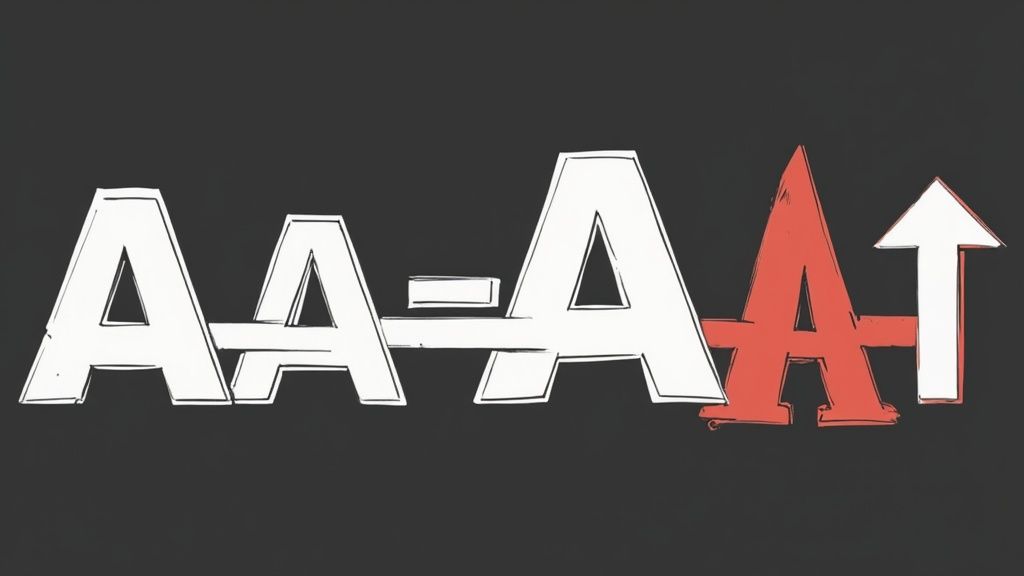
1. Master Typography Hierarchy
Typography hierarchy is the art of arranging text to guide a reader’s eye through content based on importance. It’s a fundamental graphic design tips that transforms a wall of text into a clear, scannable, and engaging narrative. By strategically varying font size, weight (boldness), color, and spacing, you create a visual path that tells users what to read first, second, and so on. This isn’t just about aesthetics; it’s about functionality, improving readability, and ensuring your key messages are absorbed effortlessly.
Look at Apple’s website for a masterclass in this. Their product pages use a large, bold headline (H1) for the product name, a slightly smaller sub-headline (H2) for the key feature, and standard body text for details. This clear structure ensures you instantly grasp the most critical information. Similarly, Medium’s article layout uses distinct styles for the title, subtitle, and body copy, making long-form content digestible.
How to Implement Typographic Hierarchy
To build a strong visual flow, start with a defined system. Don’t just randomly pick sizes; establish a typographic scale. A common approach is to use a multiplier (like 1.25 or 1.618) to create harmonious size steps for your H1, H2, H3, and body text.
- Establish a Type Scale: Define clear sizes for each text level (e.g., body at 16px, H3 at 24px, H2 at 32px, H1 at 48px). This creates consistency across your entire digital presence.
- Limit Your Weights: Stick to two or three font weights at most (e.g., Regular, Medium, and Bold). Overusing weights can create visual noise and confusion, defeating the purpose of hierarchy.
- Use the “Squint Test”: Squint your eyes while looking at your design. The most important elements, like your main headline, should still stand out as prominent shapes, while the body text blurs into a cohesive block. If everything blends together, your hierarchy is too weak.
- Test on Real Devices: A design that looks perfect on a large desktop monitor might feel cramped or unreadable on a mobile screen. Always test your typography on the actual devices your audience uses.
By mastering this principle, you enhance user experience and ensure your brand’s messaging is communicated with precision and impact. For a deeper dive, you can explore comprehensive resources to learn more about graphic design fundamentals.
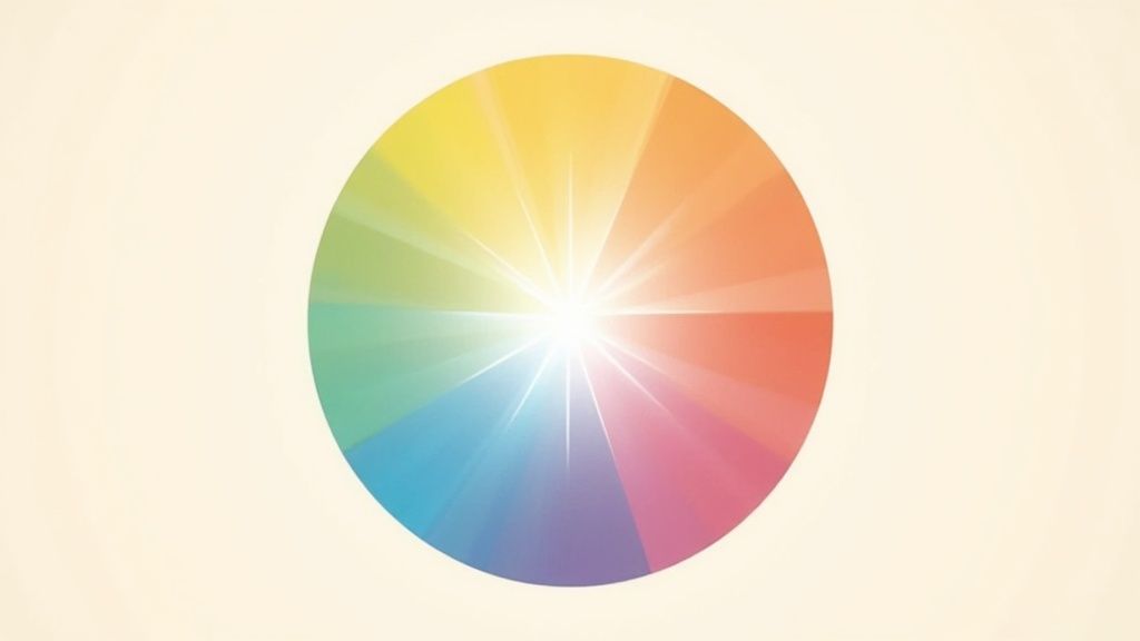
2. Understand and Apply Color Theory
Color theory is the science and art of using color, explaining how humans perceive it and the visual effects of mixing, matching, and contrasting hues. This crucial graphic design tips goes beyond just picking pretty colors; it’s about creating palettes that evoke specific emotions and communicate a brand’s core message. By understanding color relationships, psychological impact, and cultural context, you can build a visual identity that is both harmonious and purposeful, guiding user perception and strengthening brand recall.
Iconic brands master this. Coca-Cola’s vibrant red conveys energy and excitement, while Facebook’s dependable blue is used to build a sense of trust and reliability. Spotify chose green to represent its brand’s vitality and connection to discovery. These choices are deliberate, leveraging color psychology to forge an immediate connection with the audience and make the brand instantly recognizable in a crowded market.
How to Implement Color Theory
A strategic approach to color ensures consistency and impact. Instead of random selections, build a defined palette that serves your brand’s goals. Start by understanding the color wheel and common harmonies like complementary, analogous, and triadic schemes.
- Apply the 60-30-10 Rule: For a balanced design, allocate 60% of your space to a dominant primary color, 30% to a secondary color, and 10% to an accent color for highlights and calls-to-action.
- Test in Grayscale: Before finalizing your palette, view your design in grayscale. This helps you check if the contrast and hierarchy are effective without relying on color, ensuring usability for all.
- Prioritize Accessibility: Use tools like WebAIM’s contrast checker to ensure your text and background colors have sufficient contrast, making your content readable for users with visual impairments.
- Define a Brand Palette: Create a formal palette with primary, secondary, and neutral colors. This system provides a consistent foundation for all your marketing materials, from your website to social media graphics.
3. Embrace White Space (Negative Space)
White space, also known as negative space, is the unmarked area around and between the elements in your design. Far from being “wasted” space, it’s an active and powerful tool that enhances clarity, creates focus, and imparts a sense of sophistication and professionalism. This fundamental graphic design tip is about using emptiness strategically to guide the user’s eye, reduce cognitive load, and allow your core message to breathe and stand out.
Luxury brands and tech giants master this concept. Consider Google’s homepage; its vast white space directs all attention to the search bar, its single most important function. Similarly, Apple’s product pages use generous negative space to make product images feel premium and to keep the focus on key features without distraction. This intentional use of space elevates the design and improves the user experience.
How to Implement White Space Effectively
Implementing white space requires treating it with the same importance as any other visual element like typography or color. It’s about creating balance and intention, not just leaving areas blank.
- Prioritize It: Don’t be afraid to leave areas empty. A common mistake is feeling the need to fill every pixel. Start with more white space than you think you need and then adjust. This helps prevent a cluttered, overwhelming layout.
- Group Related Elements: Use white space (or proximity) to create logical groupings. By placing related items close together and separating them from other groups with space, you create an intuitive visual structure without needing boxes or lines.
- Boost Readability: Increase the space between lines of text (leading) and around paragraphs to make long-form content less intimidating and easier to read.
- Create Focus and Drama: Surround your most critical element, like a call-to-action button or a hero image, with ample negative space. This separation naturally draws the eye and emphasizes its importance.
By embracing white space, you give your design elements room to shine, leading to a cleaner, more effective, and professional visual identity. For those looking to refine their brand’s visual strategy, consider exploring custom solutions for brand identity.
4. Create Strong Visual Hierarchy
Visual hierarchy is the principle of arranging elements to show their order of importance, creating a deliberate path for the viewer’s eye. It’s a core graphic design tips that uses tools like size, color, contrast, and placement to direct attention and improve how users interact with your content. By establishing a clear hierarchy, you tell users exactly where to look first, what’s a call-to-action, and what is secondary information, making your design intuitive and effective.

Consider Amazon’s product pages, where the “Add to Cart” button is bright and prominent, while less critical details are smaller and less conspicuous. Similarly, the Uber app’s interface prioritizes the “Where to?” search bar, making the primary action immediately obvious. This strategic guidance, rooted in Gestalt psychology, prevents confusion and helps users achieve their goals quickly.
How to Implement Visual Hierarchy
A strong hierarchy is built on purpose, not just aesthetics. Start by identifying the single most important element on the page and then rank everything else relative to it.
- Follow Reading Patterns: For web layouts, use natural reading patterns like the “Z-pattern” or “F-pattern.” Place your most important elements along these paths to align with how users instinctively scan a page.
- Scale for Importance: Make your primary element significantly larger than secondary ones. A simple rule is to make the focal point at least two to three times bigger to ensure it grabs attention first.
- Use Color Strategically: Employ a bright, contrasting color for key actions, like buttons or crucial links. This color should be used sparingly to maintain its power and signal interactivity.
- Conduct the “5-Second Test”: Show your design to someone for just five seconds and ask them what they remember. If they can’t identify the main message or primary action, your hierarchy needs strengthening.
5. Maintain Consistent Alignment and Grid Systems
Alignment and grid systems are the invisible scaffolding of great design. They provide a foundational structure that organizes content, creates visual harmony, and establishes a professional appearance. Consistent alignment improves readability by guiding the eye logically across a page, while grid systems ensure that all elements maintain proportional and balanced relationships with each other. This is one of the most critical graphic design tips for creating polished, cohesive layouts.
Vogue magazine’s sophisticated print and digital layouts exemplify this, using complex grids to balance imagery and text with elegance. On the web, Bootstrap’s 12-column responsive grid system has become an industry standard, allowing for flexible yet structured designs that adapt seamlessly to any screen. Even Instagram’s simple, iconic photo grid demonstrates how a consistent system creates a predictable and satisfying user experience.
How to Implement Alignment and Grid Systems
Adopting a systematic approach to placement transforms a cluttered design into a clean, organized one. The key is to create and stick to a defined framework rather than placing elements arbitrarily. This discipline builds visual rhythm and predictability for the user.
- Use a Baseline Grid: Implement an 8px or 4px grid system for spacing and sizing. This ensures that the vertical and horizontal distances between all elements are multiples of a base number, creating subtle consistency.
- Align to Invisible Lines: Instead of just centering elements, align them to shared invisible lines on your grid. Aligning text baselines, image edges, and button borders creates a much stronger sense of order.
- Break the Grid Strategically: Once you have a strong grid, you can intentionally break it to draw attention to a key element. A single image or block of text that overlaps grid lines can create a powerful focal point.
- Test Across Devices: A grid that works on a desktop may break on a mobile device. Always test your grid systems to ensure they are responsive and maintain their structural integrity across different screen sizes.
By mastering this principle, you ensure your designs are not only beautiful but also functional and easy to navigate. To explore this further, you can find a guide to understand more about web design layouts.
6. Choose Appropriate Fonts and Limit Font Families
Font selection is far more than just picking a pretty typeface; it’s a critical graphic design tips that directly shapes your brand’s personality, readability, and overall user experience. The fonts you choose communicate a specific tone, whether professional, playful, modern, or classic. Limiting your font families, typically to a maximum of two or three, is essential for creating a cohesive and uncluttered visual identity. This strategic restraint prevents visual chaos and reinforces brand consistency across all touchpoints.
Think about Spotify’s use of its Circular font. This choice creates a unified, recognizable experience from the mobile app to their web player and marketing materials, making the brand feel instantly familiar. Similarly, Google’s custom-designed Roboto font family is used across its vast ecosystem of products, ensuring a clean, modern, and highly legible interface that works seamlessly on any device. These examples show how deliberate font selection becomes an integral part of a brand’s DNA.
How to Implement Smart Font Choices
Choosing and pairing fonts is both an art and a science. The goal is to create harmony and hierarchy, not conflict. A well-chosen font pairing can elevate a design, guiding the user’s eye and adding a layer of sophistication.
- Pair with Contrast: A classic and effective technique is to pair a serif font (like Georgia) with a sans-serif font (like Verdana). The contrast creates a clear distinction between headings and body text, enhancing readability and visual interest.
- Establish a Role for Each Font: Assign a specific purpose to each font in your limited palette. For instance, use a distinctive display font for your main headings (H1) and a highly readable workhorse font for body copy and UI elements.
- Test for Readability: A font that looks great as a large headline might be completely illegible in a small paragraph on a mobile screen. Always test your chosen fonts at their intended sizes and on the actual devices your audience will use.
- Consider Web Performance: For digital projects, remember that custom fonts must be loaded by the user’s browser. Overloading your site with too many font files can significantly slow down page load times, negatively impacting user experience and SEO.
7. Use High-Quality, Purposeful Images
Images are powerful communication tools that convey emotion, brand values, and information instantly. This graphic design tips emphasizes using high-quality visuals that do more than just fill space; they must serve a clear purpose and support your core message. Purposeful imagery strengthens your narrative, builds trust, and creates a more immersive brand experience. Low-resolution or generic stock photos can cheapen your brand, while thoughtful, professional images elevate it.
Look at Patagonia’s brand identity for a prime example. Their authentic, rugged outdoor photography isn’t just decoration; it directly supports their environmental message and active lifestyle ethos. Similarly, Airbnb uses authentic photos from hosts to build trust and sell an experience, not just a room. These brands understand that images are a direct line to their audience’s emotions and aspirations.
How to Implement Purposeful Imagery
Selecting the right images requires a strategic approach that aligns with your brand’s voice and goals. Your visual library should be as curated as your written content, with every image chosen to resonate with your target audience and reinforce your message.
- Invest in Custom Photography: When the budget allows, custom photography is unbeatable for showcasing your products, team, or services authentically. It ensures your visuals are unique and perfectly aligned with your brand.
- Maintain a Consistent Editing Style: Apply a consistent filter, color grade, or editing style across all your images. This creates a cohesive and professional look for your website, social media, and marketing materials.
- Optimize for the Web: High-resolution images are essential, but large file sizes can slow down your website. Use tools to compress and optimize images for the web without a noticeable loss in quality, ensuring a fast user experience.
- Ensure Images Reflect Your Audience: Use visuals that your target audience can see themselves in. Brands like Dove’s “Real Beauty” campaign succeeded by featuring diverse, unretouched photos that resonated deeply with real people.
- Prioritize Accessibility: Always use descriptive alt text for your images. This makes your content accessible to visually impaired users who use screen readers and also improves your SEO.
8. Create Strong Contrast for Readability
Contrast is the visual difference between elements, and it is one of the most critical graphic design tips for ensuring clarity and accessibility. Strong contrast makes text legible and helps users distinguish between different parts of a design, creating a clear visual hierarchy and drawing attention to key information. This principle is not just about making things look good; it’s a cornerstone of inclusive design, ensuring content is accessible to everyone, including users with visual impairments.
Good contrast makes an interface feel clean, direct, and effortless to navigate. Look at Wikipedia’s classic black-on-white design or Medium’s reading interface; their high-contrast approach prioritizes readability above all else. Similarly, Stripe’s documentation uses excellent contrast ratios, making complex information easy to parse. This focus on legibility builds trust and improves the overall user experience by reducing cognitive load.
How to Implement Strong Contrast
Implementing effective contrast requires a deliberate approach that balances aesthetics with the strict guidelines of accessibility standards. It’s about more than just picking a dark color and a light color; it’s about verifying their relationship.
- Meet Accessibility Standards: Use an online contrast checker to ensure your color combinations meet the Web Content Accessibility Guidelines (WCAG). Aim for a minimum contrast ratio of 4.5:1 for normal text and 3:1 for large text (18pt or 14pt bold).
- Don’t Rely Only on Color: Never use color alone to convey crucial information, such as an error state or a selected item. Supplement color with icons, text labels, or other visual cues to ensure everyone understands the message.
- Test in Varied Environments: A design that looks great on your calibrated monitor may fail in bright sunlight or on a low-quality screen. Test your designs in different lighting conditions and on various devices to confirm legibility.
- Use Contrast to Guide the Eye: Beyond text, use contrast to make important elements like call-to-action buttons pop. A brightly colored button against a muted background naturally draws user attention and encourages clicks.
9. Understand Your Target Audience
Effective graphic design is not about what you like; it’s about what resonates with your intended viewers. This is one of the most crucial graphic design tips because it anchors every creative decision in strategy. Understanding your target audience’s preferences, behaviors, and cultural context ensures that your visuals communicate effectively, build trust, and drive action. From color palettes to typography, every element should be chosen with the end-user in mind.
Consider how major brands tailor their designs. Nike creates distinct campaigns for different athlete demographics, using rugged, earthy tones for trail runners and vibrant, energetic visuals for basketball players. Similarly, AARP uses large fonts and high-contrast layouts to cater to its older audience, prioritizing readability and accessibility. This audience-first approach, popularized by pioneers like David Ogilvy, turns design from a subjective art into a targeted business tool.
How to Implement Audience-Centric Design
Integrating audience insights requires a proactive, research-based process. This ensures your design choices are based on data, not assumptions, leading to a stronger connection with your potential customers.
- Create Detailed User Personas: Go beyond basic demographics. Build fictional profiles representing your ideal customers, including their goals, frustrations, and media consumption habits. This will guide your creative direction.
- Test Designs with Real Users: Before launching, get feedback from a sample group of your target audience. Use A/B tests or focus groups to see which design elements perform best and why.
- Consider Accessibility: Good design is inclusive. Ensure your color contrasts, font sizes, and layouts are accessible to people with visual impairments or other disabilities.
- Stay Updated on Trends: Audience preferences evolve. Continuously monitor social trends, cultural shifts, and competitor strategies to keep your visual identity relevant and engaging.
By aligning your design with audience needs, you create visuals that not only look good but also perform exceptionally. To delve deeper into aligning visual strategy with consumer behavior, you can explore detailed guides to learn more about audience-focused marketing.
10. Keep It Simple – Less Is More
Simplicity is one of the most powerful yet challenging graphic design tips to master. The principle of “less is more,” popularized by architect Ludwig Mies van der Rohe, emphasizes removing every non-essential element to enhance clarity and impact. A simple design isn’t an empty one; it’s a focused one where every component serves a distinct purpose. By reducing visual clutter, you lower the cognitive load on your audience, allowing them to understand your message instantly and effectively.
Consider the Google homepage. Its design is the epitome of simplicity, featuring just a logo, a search bar, and a couple of buttons. This laser-focus on a single action (searching) has made it one of the most functional and recognizable interfaces in the world. Similarly, Apple’s product packaging strips away all distractions, using abundant white space and minimal text to make the product itself the hero. This minimalist approach conveys confidence and premium quality.
How to Implement Simplicity in Your Designs
Achieving effective simplicity requires a disciplined, intentional approach. It’s about subtraction, not addition. The goal is to distill your design down to its most crucial elements, ensuring each one is working hard to communicate your core message.
- Focus on a Single Goal: Every design should have one primary call to action or key message. Ask yourself: “What is the single most important thing I want the viewer to do or understand?” and eliminate anything that detracts from that.
- Embrace Negative Space: Don’t fear empty areas. White space (or negative space) is an active design element that creates breathing room, improves readability, and guides the eye toward important content.
- Question Every Element: Scrutinize every line, color, image, and word. Ask if it adds value or serves a functional purpose. If the answer is no, or if you hesitate, remove it. Test the design without it; if it doesn’t break, leave it out.
- Limit Your Choices: Stick to a limited color palette, one or two typefaces, and a simple grid structure. Constraints force creativity and prevent visual chaos.
Top 10 Graphic Design Tips Comparison
| Item | Implementation Complexity 🔄 | Resource Requirements ⚡ | Expected Outcomes 📊 | Ideal Use Cases 💡 | Key Advantages ⭐ |
|---|---|---|---|---|---|
| Master Typography Hierarchy | Moderate – requires balance and testing | Low – mainly design skills and tools | Clear content flow, improved readability, professional look | Websites, articles, digital media | Guides user attention effectively, enhances UX |
| Understand and Apply Color Theory | Moderate – involves theory and testing | Medium – requires color tools and research | Emotional connection, brand consistency, user influence | Branding, UI design, advertising | Establishes emotional appeal, improves visual harmony |
| Embrace White Space (Negative Space) | Low – conceptual, requires restraint | Low – design approach | Increased readability, premium look, reduced clutter | Minimalist design, mobile-friendly layouts | Creates focus, improves comprehension, reduces cognitive load |
| Create Strong Visual Hierarchy | Moderate – needs deliberate arrangement | Low to medium design resources | Directed user focus, logical content flow, better engagement | Complex interfaces, content-heavy designs | Enhances user flow, makes information digestible |
| Maintain Consistent Alignment and Grid Systems | Moderate to High – setup and planning | Medium – requires grid systems and tools | Uniform layouts, improved readability, faster design process | Multi-page design, responsive web layouts | Creates harmony, speeds design, ensures consistency |
| Choose Appropriate Fonts and Limit Font Families | Moderate – font pairing and testing | Low to Medium – font licenses and tools | Consistent brand tone, improved readability, reduced load times | Branding, web and print typography | Establishes personality, simplifies decisions |
| Use High-Quality, Purposeful Images | Moderate – sourcing/creating and optimizing | Medium to High – licensing or production costs | Strong emotional impact, increased engagement, better SEO | Marketing, social media, brand storytelling | Communicates quickly and effectively, supports professionalism |
| Create Strong Contrast for Readability | Low to Moderate – requires testing | Low – design adjustments | Enhanced accessibility, better readability, clear hierarchy | Accessibility-focused design, text-heavy layouts | Improves legibility, meets accessibility standards |
| Understand Your Target Audience | High – requires research and analysis | High – time and tools for audience study | More effective communication, better engagement, targeted design | Market-specific campaigns, user-centered design | Guides design strategy, improves conversion rates |
| Keep It Simple – Less Is More | Low to Moderate – simplification process | Low – focus on essentials | Clear communication, timeless aesthetics, reduced complexity | Minimalist brands, digital applications | Improves comprehension, faster loading, classic appeal |
Bringing It All Together: From Tips to Transformation
We’ve explored ten foundational graphic design tips that serve as the building blocks for a powerful and effective brand identity. Moving beyond isolated advice, the true magic happens when you see these principles not as a checklist, but as an interconnected system for clear communication. From establishing a strong visual hierarchy with typography and contrast to creating harmony with color theory and consistent alignment, each element works in concert with the others.
The journey from a novice to a proficient designer involves internalizing how these concepts influence user perception. Embracing white space isn’t just about leaving areas blank; it’s a strategic choice to guide the eye and reduce cognitive load. Limiting your font families isn’t a restrictive rule but a method for building a recognizable, cohesive brand voice. These aren’t just “design” tasks; they are business-critical decisions that directly impact how your audience understands, trusts, and connects with your brand.
Key Takeaways for Immediate Impact
To translate this knowledge into action, focus on these overarching themes:
- Clarity Above All: Your primary goal is to communicate a message. Every design choice, from font selection to image placement, must support this goal. If an element distracts or confuses, it’s working against you.
- Consistency Builds Trust: A consistent visual language across all platforms makes your brand feel reliable and professional. Apply your established rules for color, typography, and layout everywhere your brand appears.
- Audience-Centric Design: The most aesthetically pleasing design will fail if it doesn’t resonate with your target audience. Always start with a deep understanding of who you are trying to reach and what will appeal to them.
Mastering these graphic design tips is a transformative process. It’s about shifting from simply making things look good to strategically engineering a visual experience that drives results. By implementing these practices, you are not just creating graphics; you are building a resilient, memorable brand that can stand out in a crowded digital landscape. This investment in strategic design is an investment in your brand’s long-term authority and growth. The path to a strong visual identity is paved with intention, and these principles are your roadmap.
Ready to elevate your brand from following tips to setting trends? The expert team at KP Infotech specializes in translating foundational design principles into a cohesive, impactful visual identity that drives business growth. Let us help you build a brand that not only looks professional but also connects deeply with your audience. Discover how our graphic design services can transform your digital presence.
Frequently Asked Questions
What are the most important graphic design tips for non-designers?
Use consistent fonts, maintain visual hierarchy, and stick to your brand colors.
How do I choose the right color palette?
Use tools like Coolors.co or Adobe Color, and limit to 2–3 core colors with 1–2 accent shades.
Do I need professional design software to follow these tips?
No—tools like Canva or Figma offer beginner-friendly features that help you apply top graphic design tips without steep learning curves.